Hummus Grill
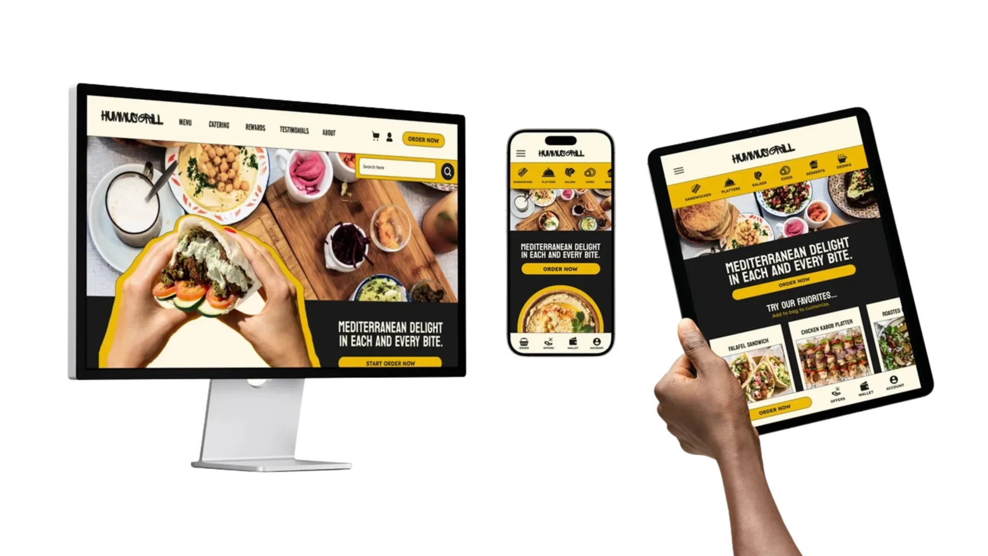
UX / UI DesignContextWhen first entering the site, users were confronted with lengthy text, a cluttered menu bar, and text overlapping busy images, creating a chaotic first impression. The color scheme and the uniform font styles throughout the headings, subheadings, and body text lacked interest. Furthermore, the crowded menu bar featured numerous buttons with unclear labels, complicating the navigation process and hindering users from quickly placing their orders. The goal of the redesign is to create a streamlined, engaging experience that prioritizes efficiency for Hummus Grill's customers.
User ResearchTo complete my redesign, I started with user research so my design would be optimized for its target audience. Here is a user persona for the website:
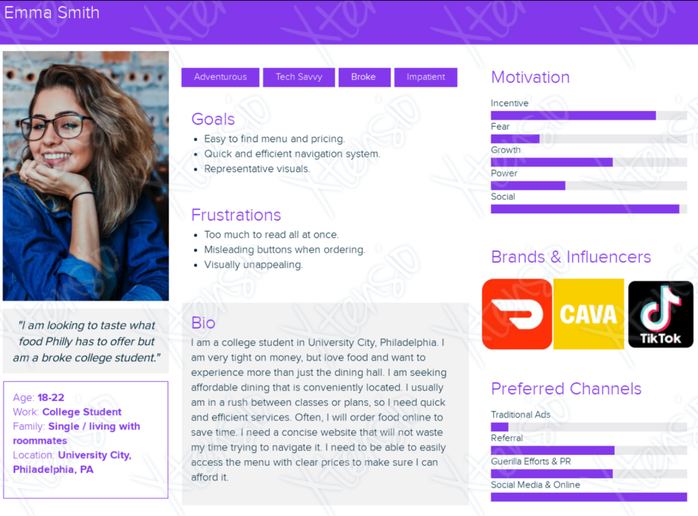
Located in University City, Hummus Grill primarily caters to college students aged 18 to 24. This demographic informs several key aspects of the redesign. Given that many students operate on tight budgets, transparency in pricing is crucial. To accommodate this tech-savvy yet often impatient audience, the website needs streamlined navigation and clear content. Simplifying text, reducing clutter, and minimizing misleading buttons are essential steps in achieving this.
Young adults are drawn to visually appealing environments, so an attractive interface is necessary to engage this audience. Users interested in Hummus Grill are likely fans of brands like Cava and Sweetgreen, which feature sleek, modern interfaces; thus, this website must align with those standards. Additionally, convenience is highly valued by this age group, making effective promotion of food delivery and takeout options vital. Expanding Hummus Grill’s social media presence and linking accounts to the homepage can further enhance engagement with this demographic.
Design ChoicesBefore creating the high-fidelity model of the website, I selected a cohesive color scheme, typography, and fundamental design elements:
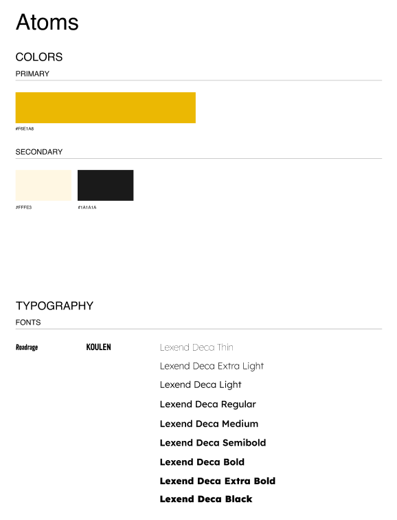
In selecting a color scheme for the Hummus Grill redesign, my two primary considerations were achieving the goal of modernization and the overall vibe of the restaurant. The color palette features shades of yellow, off-white, and dark gray, maintaining a simple yet effective combination of black and white (two colors prevalent in modern design) accented by the vibrant yellow. This bold accent color is intended to reflect the energetic and youthful atmosphere that appeals to college students seeking affordable Mediterranean food.
The chosen colors of black, white, and yellow convey trendiness, with yellow symbolizing youthfulness and vitality. This color selection intentionally avoids a traditional Mediterranean palette while still evoking a sense of connection to the cuisine, as yellow can represent sunshine, brightness, hummus, and citrus fruits.
For typography, I selected three fonts: Roadrage, Koulen, and Lexend Deca, each chosen to evoke the desired feelings. Roadrage is a rough, slightly crooked font that adds a youthful, relatable touch for the target audience. Koulen serves as a cleaner, bolder typeface, used for more concise text. Lastly, Lexend Deca is employed as the body text, designed specifically for digital interfaces to enhance readability and reduce eye strain. Collectively, these fonts embody a modern aesthetic that aligns with the overall redesign goals.
Final DesignThe final redesign prototypes include a desktop, mobile, and tablet version.