Kami Food Truck App
UX RESEARCH & DESIGNTools: Figma, FigJam, Google Forms, Illustrator, After Effects
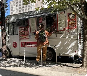
OverviewKami is a popular Korean food truck located on Drexel University’s campus, known for its fast service and being the only Korean food truck in University City. Over a ten-week project, our team designed a hypothetical mobile ordering app that translates Kami’s efficient and personable in-person truck experience into a streamlined digital flow.
Working as a team of five allowed us to iterate quickly, test designs across a broad range of users, and refine the experience week by week. Through on-site observation, interviews, and repeated usability testing, we identified opportunities to reduce friction during peak hours, clarify menu options, and support repeat customers. The final solution prioritizes speed, clarity, and brand recognition, resulting in an intuitive ordering experience grounded in real user behavior.
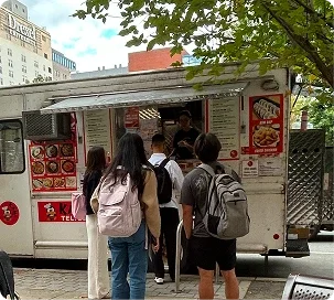
Context & ChallengeKami serves students, staff, and nearby workers outside Drexel’s library at 33rd and Market, with most orders placed quickly between classes where speed and clarity matter. This was a team project completed by five designers who collaborated across research, ideation, testing, iteration, and visual design, with responsibilities distributed based on individual strengths while maintaining shared ownership.
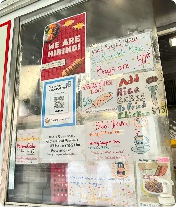
Despite its popularity, Kami’s ordering experience creates friction. Hours of operation are difficult to find, especially during holidays, long lines form during class breaks, and the physical menu makes pricing, add-ons, and dietary needs harder to scan. The goal of this project was to reduce friction in the ordering process while preserving Kami’s fast, approachable feel, improving menu clarity and customization visibility, and supporting repeat customers through saved orders and more efficient reordering.
Process & INsightInitial Research
We began with Fly-on-the-Wall observations, documenting real, unbiased ordering interactions at different times of day. Customers rarely waited longer than ten minutes, and staff consistently guided users through customizations, reinforcing efficiency as a core value.
To build on these observations, we conducted brief, in-person interviews at the truck, approaching customers while they waited or just after receiving their orders. With permission, we asked a short set of questions about their experiences, confirming that speed and clarity were the most important factors and allowing us to identify consistent patterns across a broad group of users.
Team Collaboration
The pace of the project required strong communication and trust. Many weeks allowed only a single design–test–iterate cycle, making clear check-ins and shared documentation essential. By leaning into individual strengths while maintaining cross-functional involvement, we were able to move quickly without sacrificing design quality.
Design EvolutionAs we moved from wireframes to higher-fidelity prototypes, we conducted iterative usability testing to identify moments of confusion and hesitation. The following progressions highlight how direct user feedback shaped key screens across the app.
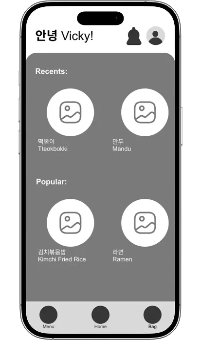
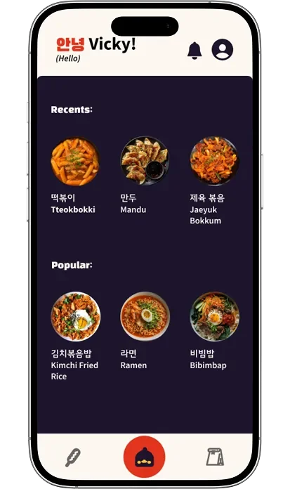
Homepage Evolution
Low Fidelity
Mid/High Fidelity
High Fidelity
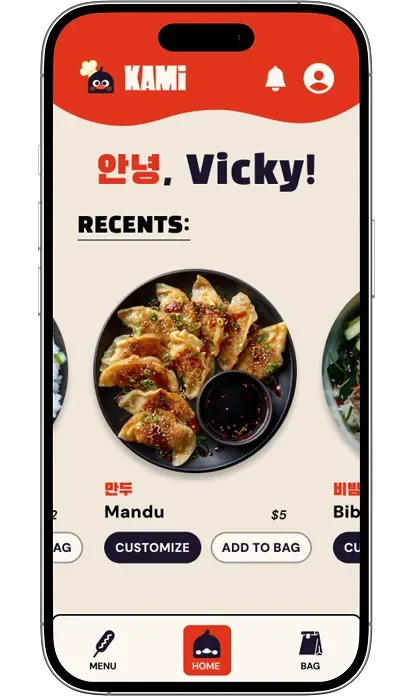
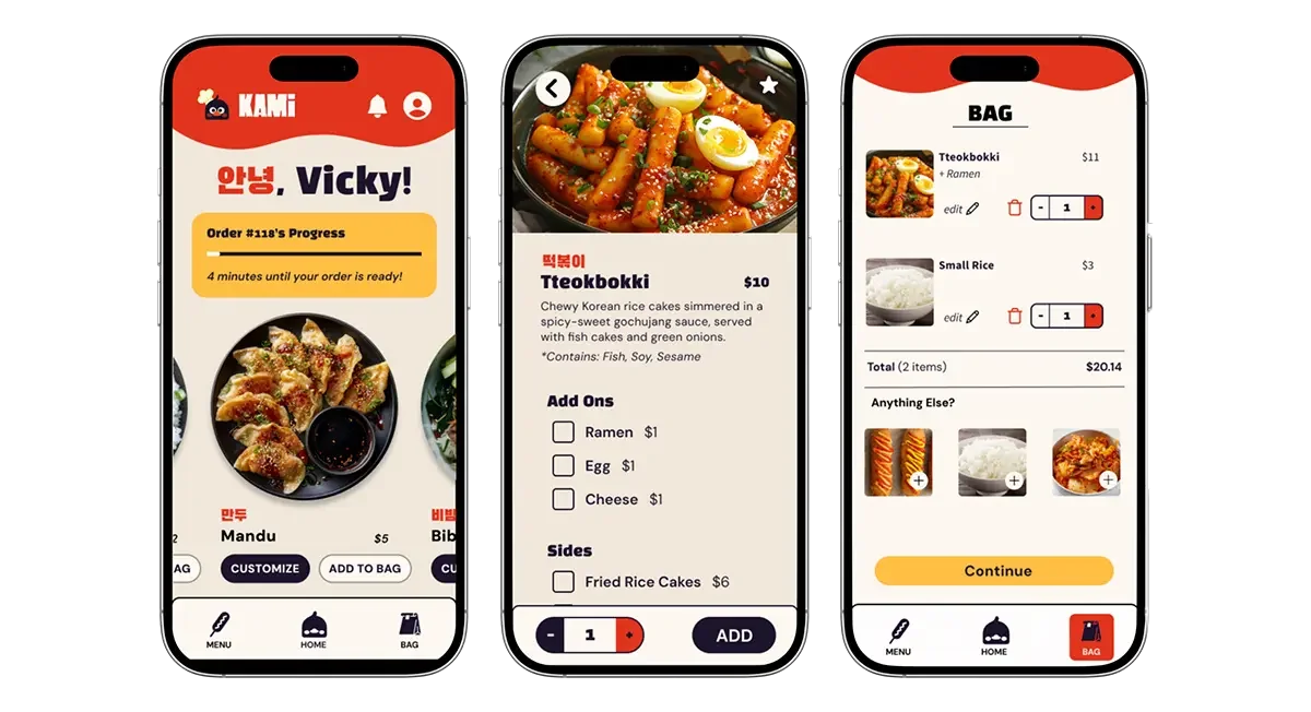
In mid-fidelity testing, users expressed frustration with the dark background, noting that it felt like the images and background were competing rather than working together. They also found the homepage overwhelming, with images that felt too small, no clear pricing upfront, and a lack of actionable buttons. One user remarked, “I see the items… what do I do with them?” In response, we simplified the layout, increased image prominence, surfaced pricing earlier, and added clear actions like Customize and Add to Bag. These changes were implemented in the final homepage design, which passed usability testing with all critical issues resolved and strong user satisfaction.
Item Page Evolution
Low Fidelity
Mid/High Fidelity
High Fidelity 1
High Fidelity 2
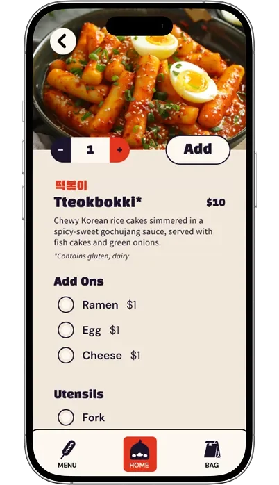
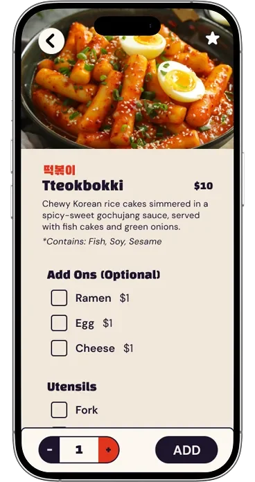
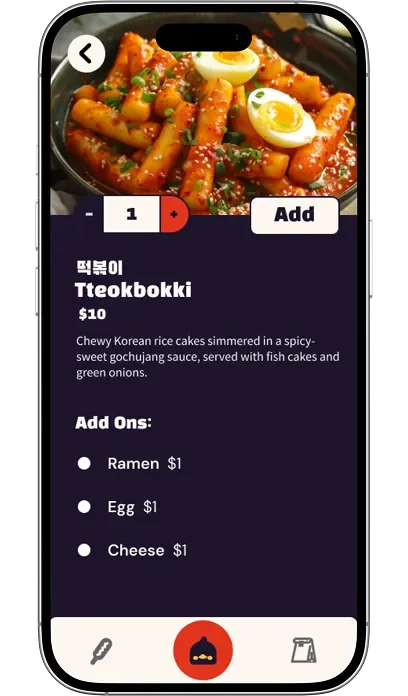
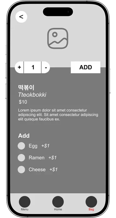
Usability testing revealed several critical issues around clarity and hierarchy. Users noted that allergen information was missing or easy to overlook, which became especially important for a cuisine some students were less familiar with. From High Fidelity 1 to High Fidelity 2, allergen text was surfaced more clearly and increased in size after users shared that it did not feel important when smaller or italicized. During think-aloud testing, a user also questioned whether multiple add-ons could be selected, highlighting confusion caused by radio buttons. We updated these to checkboxes to better align with user expectations. Additionally, multiple users noted that the quantity and Add button felt misplaced and required unnecessary scrolling. Moving these actions to the bottom of the page and making them sticky created a clearer, more intuitive progression through customization and completion.
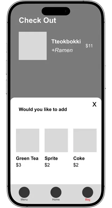
Cart Page Evolution
Low Fidelity
Mid/High Fidelity
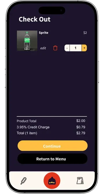
High Fidelity 2
High Fidelity 1
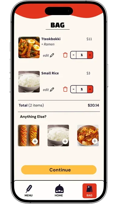
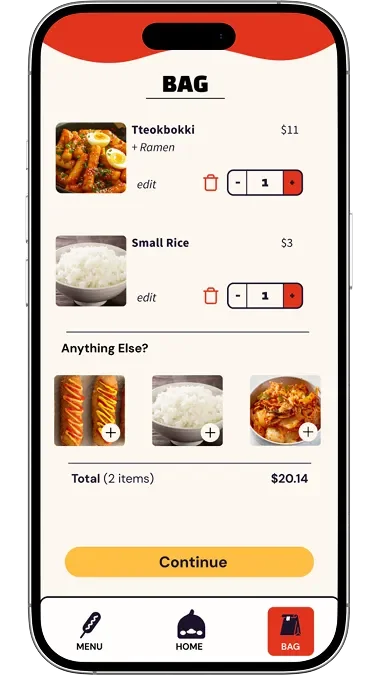
Low-fidelity testing revealed frustration with an add-on pop-up that blocked checkout and felt pushy, with one user stating, “If I don’t want to add on a drink, why’s it so hard to continue?” In response, we removed add-ons entirely in the mid-fidelity design. However, testing showed that users still wanted suggested add-ons when browsing their cart, as the page felt empty without them and side items were seen as convenient. We reintroduced add-ons in high-fidelity designs as an inline section that did not obstruct checkout. Mid-fidelity testing also surfaced issues with the dark background and low contrast, particularly on the checkout button. While High Fidelity 1 resolved most usability concerns, users noted that the order total was easy to miss, leading us in High Fidelity 2 to reposition the total directly beneath the item list and improve visual separation.
Navigation Bar Evolution

Navigation Bar 1
(placed on black background for contrast)
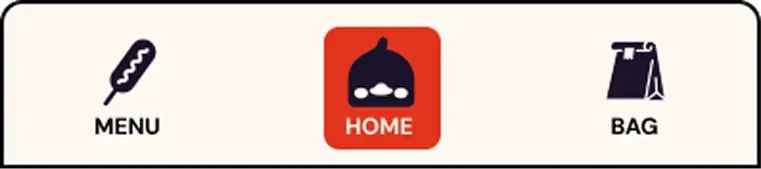
Navigation Bar 2
The navigation icons were intentionally designed to reflect Kami’s character and in-person experience. The Korean corn dog icon for Menu was inspired by user interviews at the truck, where multiple customers mentioned it as a favorite item. The duck icon for Home references a highly memorable part of Kami’s branding, and the paper bag icon for Bag mirrors how orders are handed to customers at the truck. While users appreciated the personality and uniqueness of these icons, usability testing revealed that their meaning was not always immediately clear. To address this, we added text labels to improve clarity without removing the branded visuals users responded positively to. We also updated the active state from a circular highlight to a square to better accommodate both icon and label, and introduced a dark border around the navigation bar to maintain separation as the interface shifted from dark to light backgrounds.
The SolutionThe prototyped design is a mobile ordering app centered on speed, clarity, and recognition.
Key features include:
A simple three-tab navigation system
A clearly organized menu separating mains, sides, drinks, and add-ons
Early visibility of pricing, dietary notes, and customization option
Favorites and past orders for quick repeat ordering
Account features supporting efficiency and loyalty
Conclusion & Future ImprovementsThe high fidelity prototype successfully translates Kami’s fast, personable service into a clear and efficient digital ordering experience. Usability testing showed improved clarity across the menu, item customization, cart, and payment flows compared to early iterations.
Given the ten-week timeline of this project, the team and I identified several opportunities for further refinement with more time. We would expand microinteractions to polish feedback and flow throughout the app, introduce a rewards system to better support frequent customers and encourage repeat use, and continue testing alternative menu layouts to better understand user preferences and improve scanability.