Patchwork Zine
Brand, Web, & Editorial DesignContextThe goal of this digital zine is to unite young literary voices across Philadelphia campuses, creating a space where scattered writing can come together as a patchwork of voices. It offers a way to experience writing collectively while still respecting each contributor’s individual voice.
The challenge was to design a brand and digital experience that brought these voices together with structure, without flattening individuality. The work needed to feel approachable, readable, and intentional.
I led all visual design efforts, including brand identity, editorial spreads, promotional materials, website design and UX, and overall art direction for the first issue.
Process & SolutionBrand Identity
Inspired by 90s zines, Patchwork emphasizes experimentation, community, and freedom of expression. The identity balances playful energy with structure, allowing diverse creative work to coexist within a unified system.
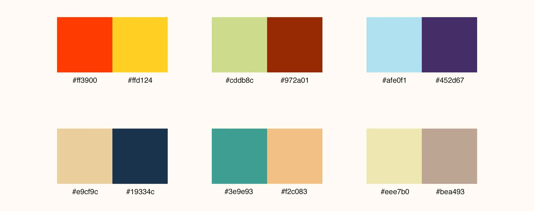
Color System
I developed a 12-color palette organized into six intentional pairings that blend vibrant and muted tones. Each pairing was designed to support thematic storytelling while maintaining consistency across print and digital applications.
Logo & Typography
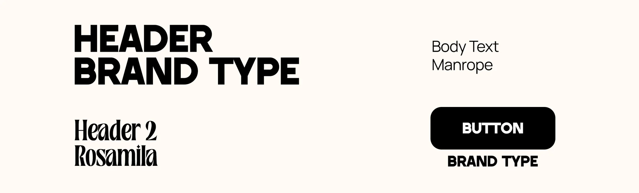
The Patchwork logo was developed through hand sketches and iterative refinement in Illustrator. The final mark is bold, dynamic, and flexible across formats. The typography system includes Brand Type for titles, Rosamila for section headers, and Manrope for body text. Together, these choices balance expressiveness with readability.
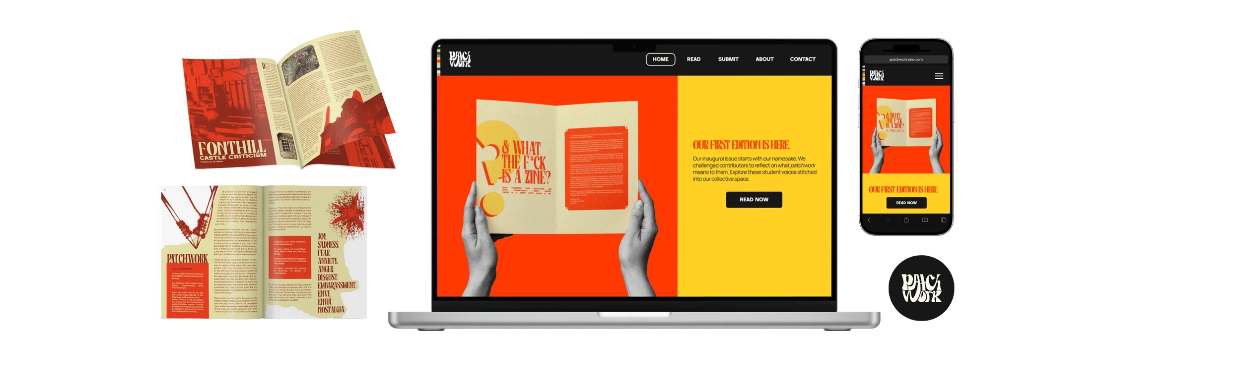
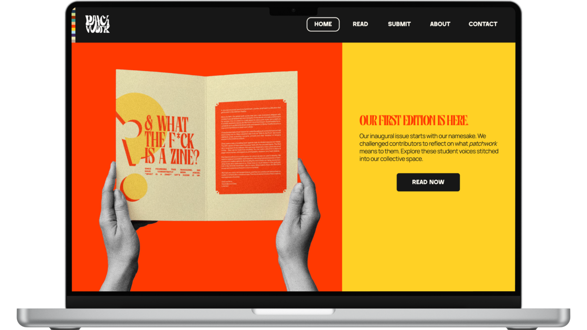
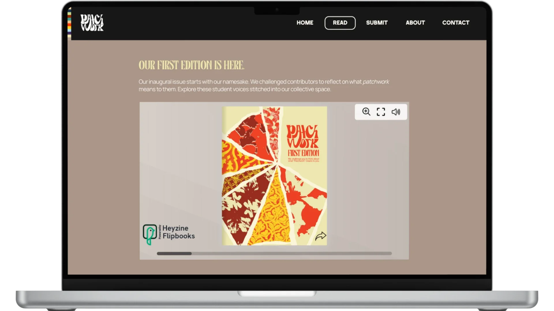
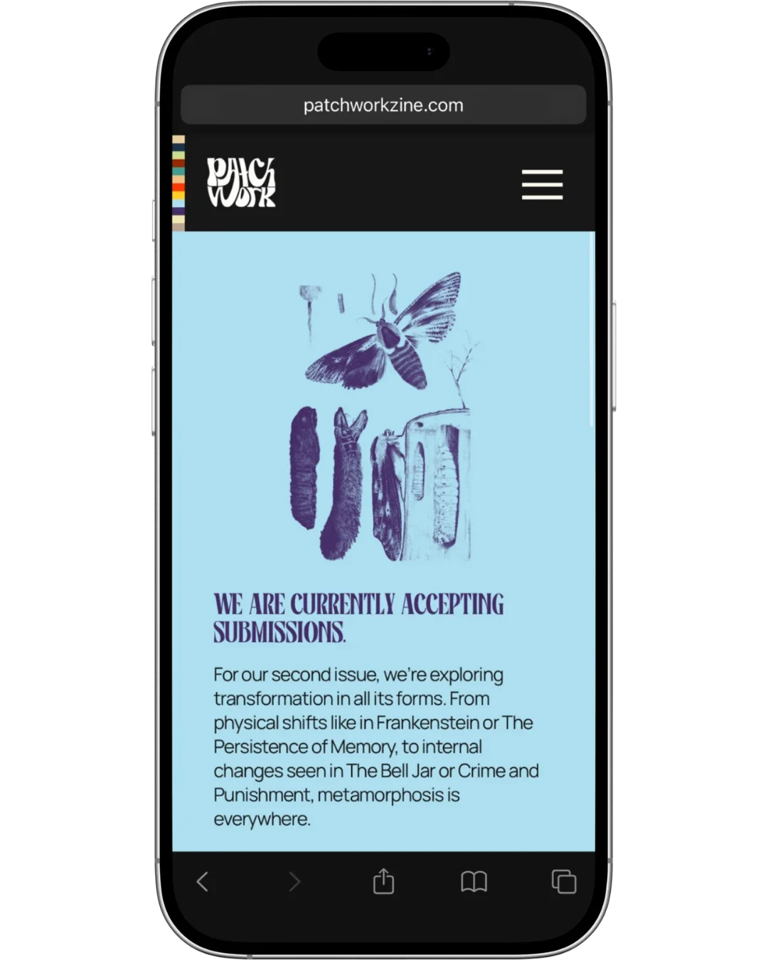
WebsiteThe website provides a straightforward platform for reading the magazine and accessing contextual information. The structure prioritizes clarity and ease of navigation, with dedicated sections for the issue, about page, and submission information.
Desktop
Mobile
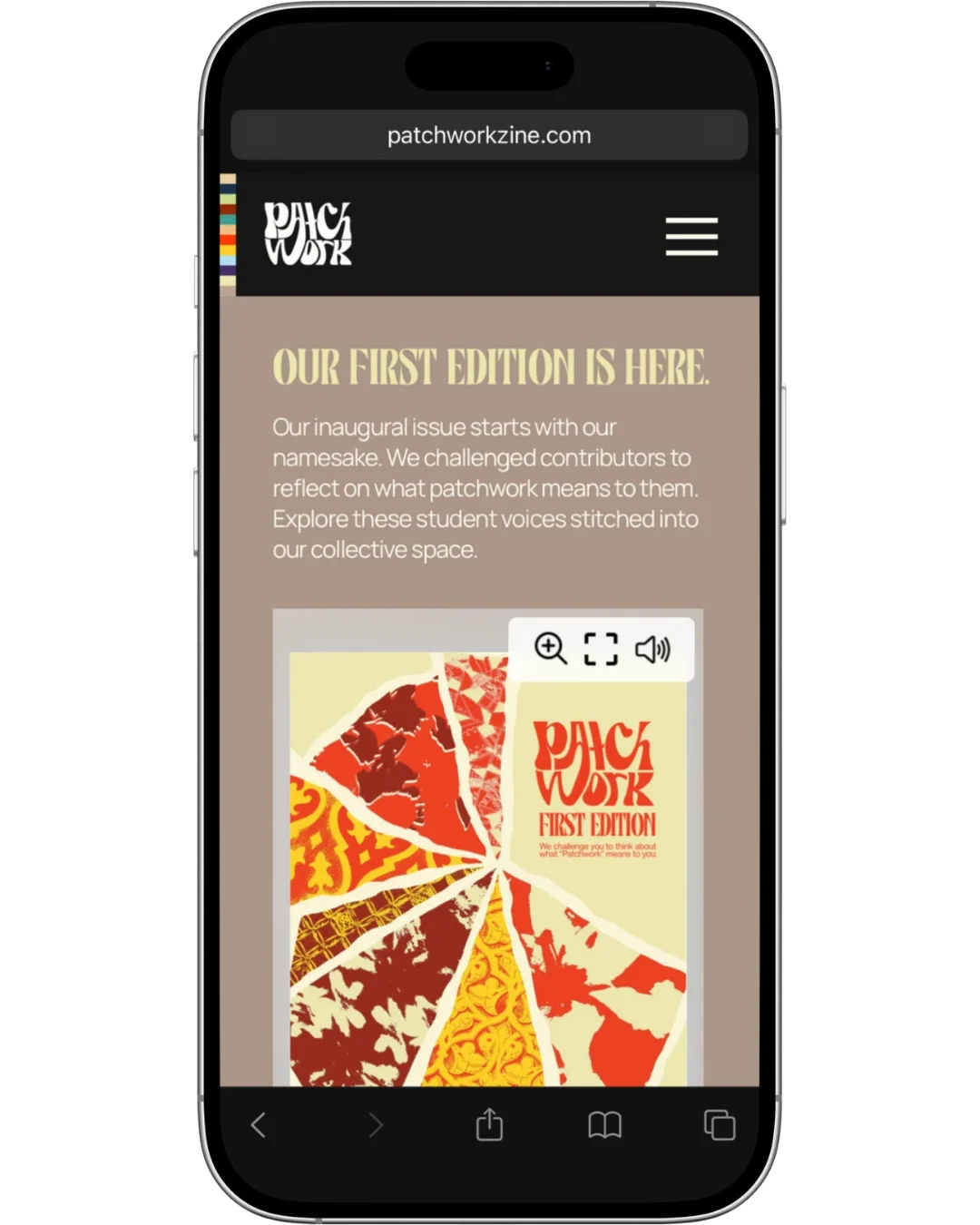
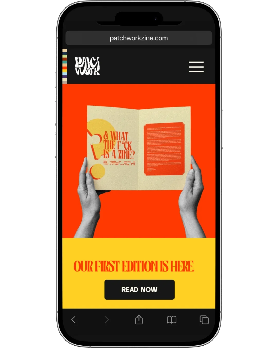
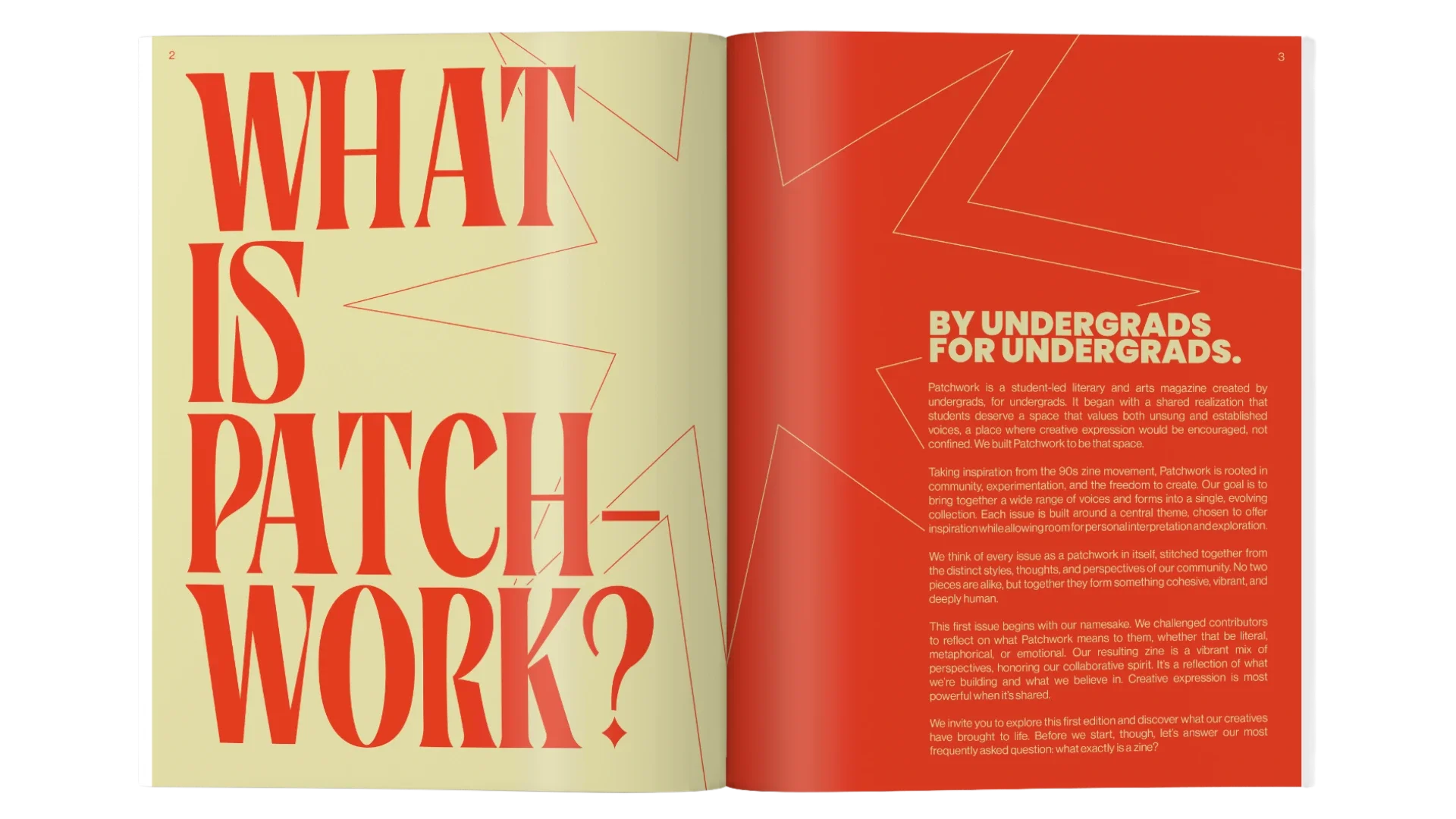
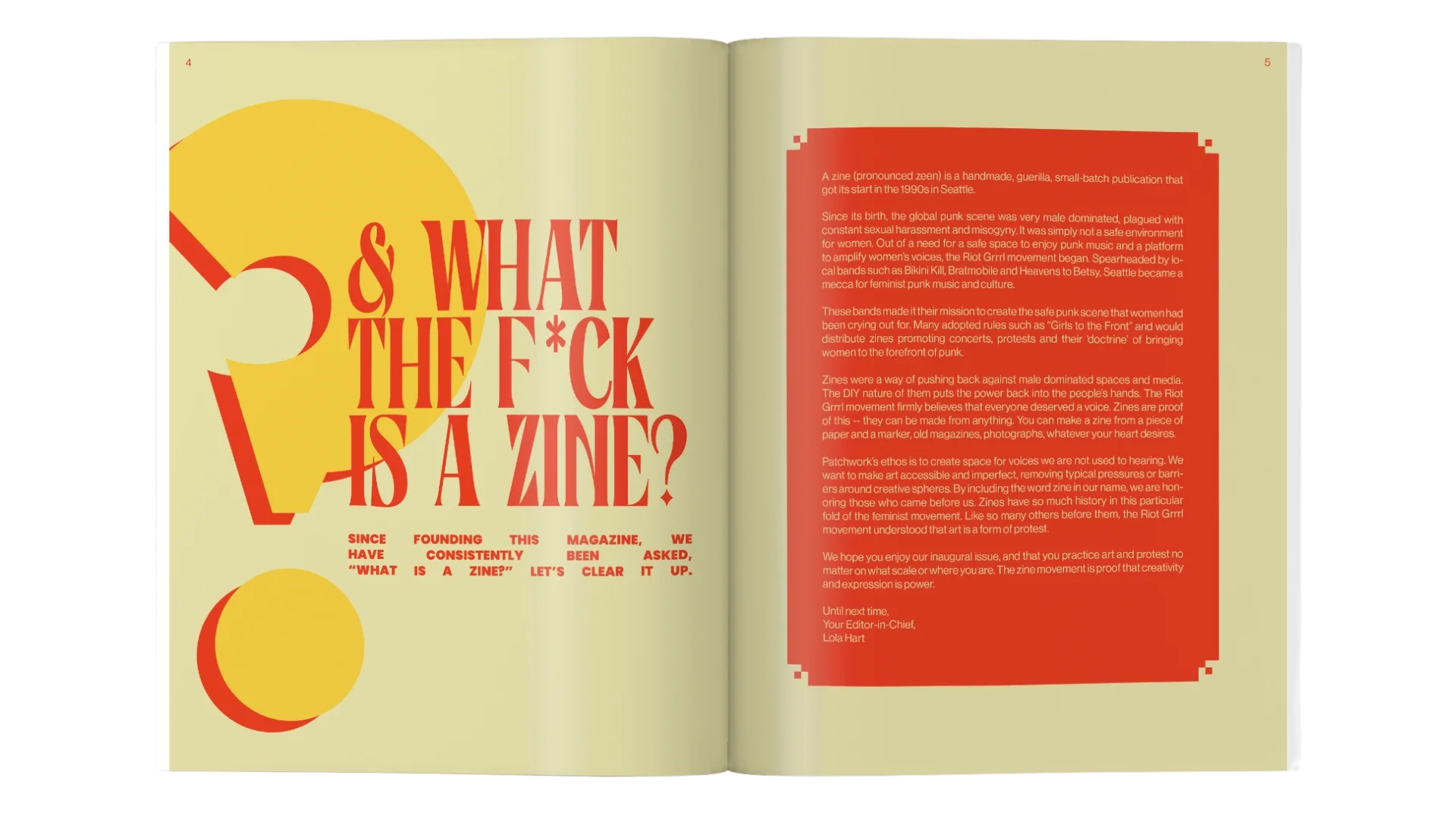
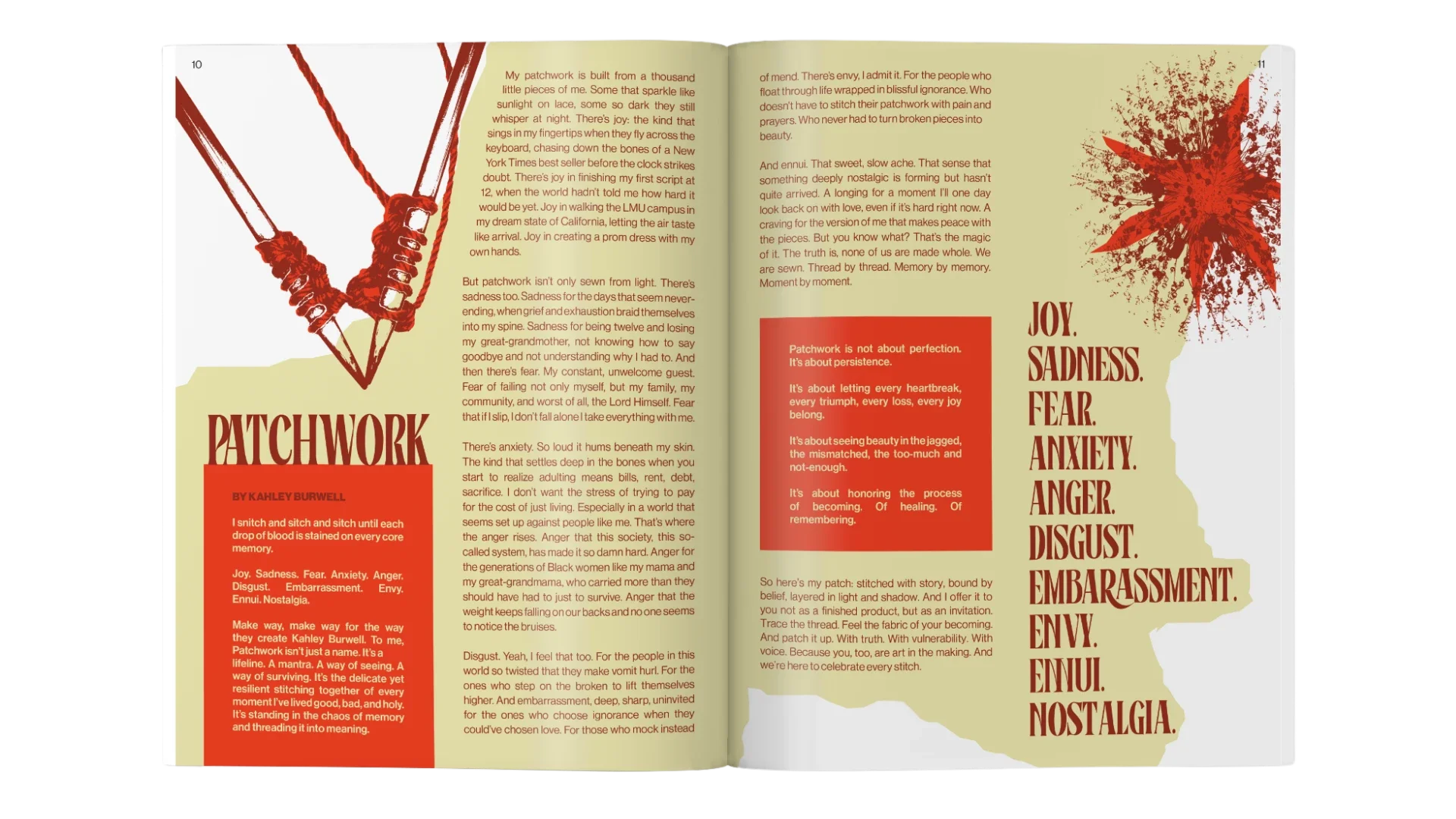
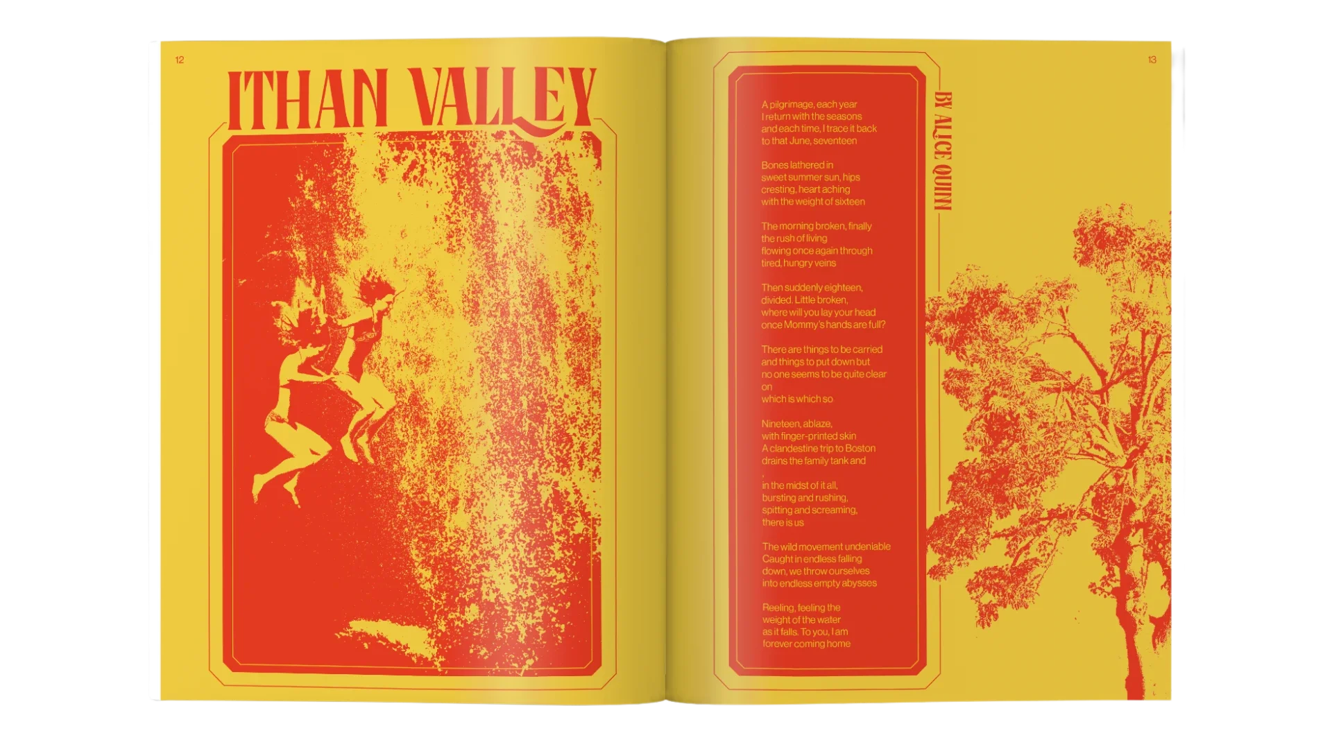
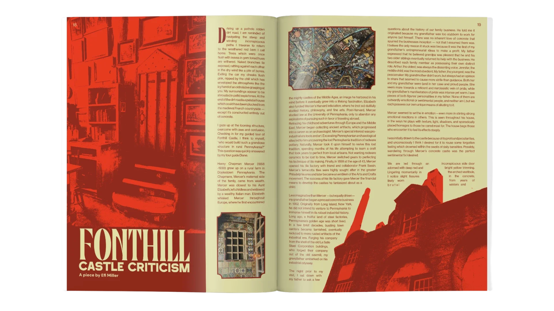
First Edition: PatchworkThe inaugural issue explored what "patchwork" means to contributors: literally, metaphorically, and emotionally. Centered around the yellow and red color pairing, the design reflects warmth and energy.
Take a look below at some standout spreads or view the full edition here.
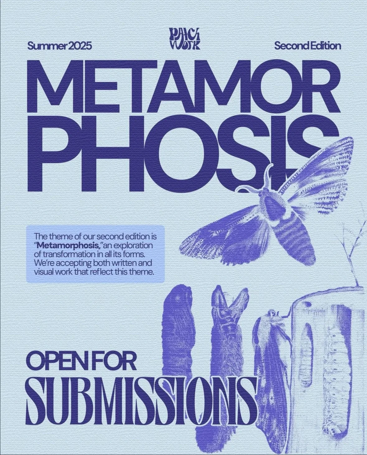
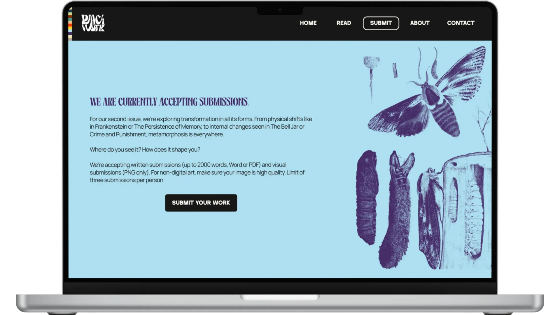
Second Edition: MetamorphosisCurrently open for submissions, this issue explores transformation in all its forms. Centered around the blue and purple color pairing, the design evokes depth and change.