SPELL Magazine
Co-Creative Director & UX DESIGNERContext-
SPELL was founded to amplify student creativity and connect Philadelphia’s arts community. The goal was to create a platform that elevates individual work while maintaining a unified identity.
We needed a magazine and website that balance cohesion with flexibility, ensuring each artist’s voice is highlighted.
-
Establish a strong, adaptable visual identity across print and digital
Build a website for browsing past editions and submitting work
Design editorial layouts that showcase artwork and writing
Support community engagement through events and workshops
-
Designed and maintain the website
Co-led creative direction across web, print, and community initiatives
Produced editorial spreads balancing typography, layout, and imagery
Curated submissions with artists across platforms
Designed promotional materials for community events
Brand IdentityWorking with my Co-Creative Director, Drew Malizia, we developed the SPELL brand system to feel bold and accessible while maintaining professionalism. We extended this identity across all touchpoints, including the website, editorial layouts, and social media. Drew led the logo design and oversees our social media presence, while I lead the design and maintenance of the website. Together, we collaborate on new spreads, updated style sheets, and general creative direction to ensure the brand continues to grow cohesively across every platform.

Website Wireframes, Colors, & Typography
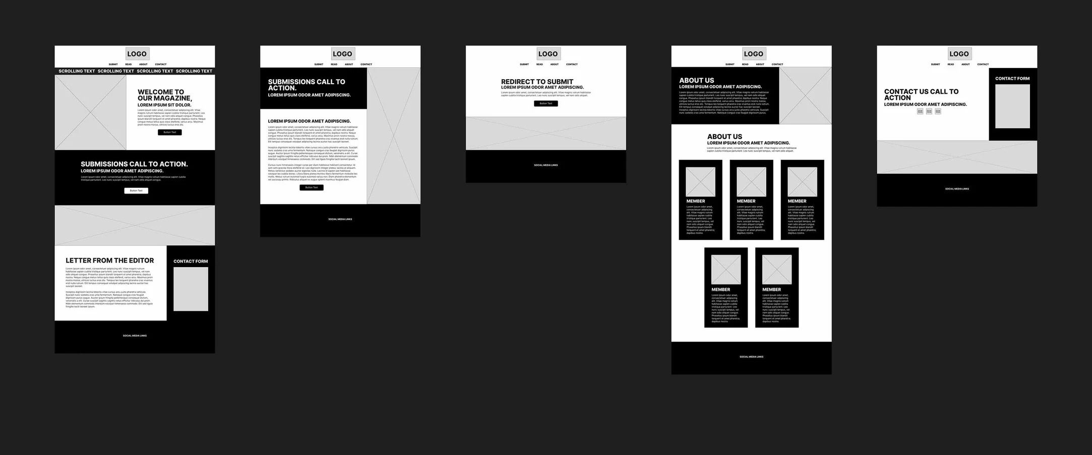
I created wireframes for key pages including the homepage, archive, submission form, about page, and events section. The website needed to be intuitive for both readers exploring content and artists submitting work. The live website has naturally shifted from these wireframes with the evolution of our website as SPELL magazine grows.
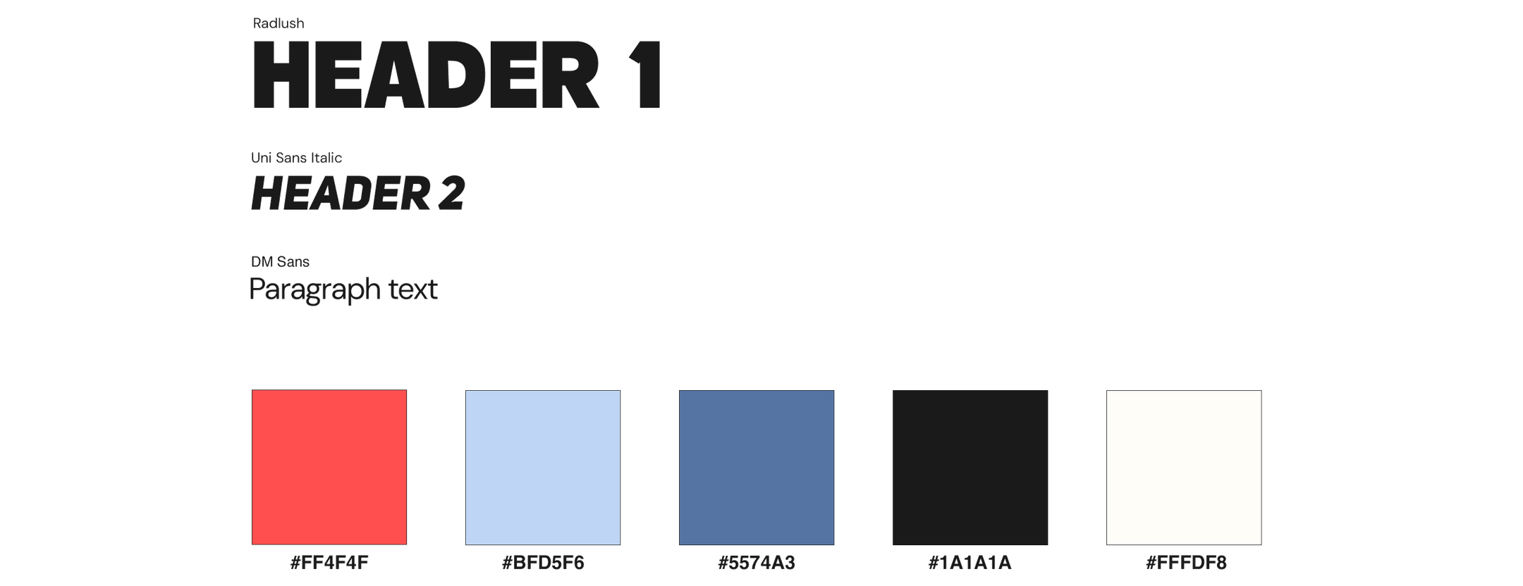
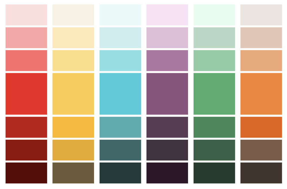
To maintain a newspaper-inspired vibe, I chose a neutral base with pops of color. A strong dark tone mimics traditional newspaper print for text and backgrounds, while a vibrant pink-red highlights important elements and adds energy. Blue tones provide balance and cool contrast, and a soft off-white creates a clean feel that's easy on the eyes.
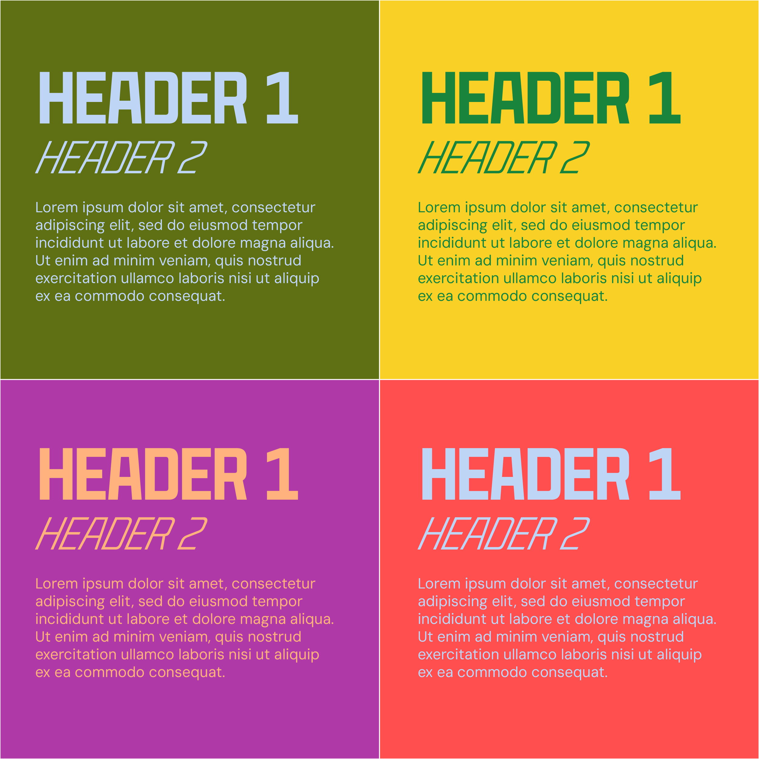
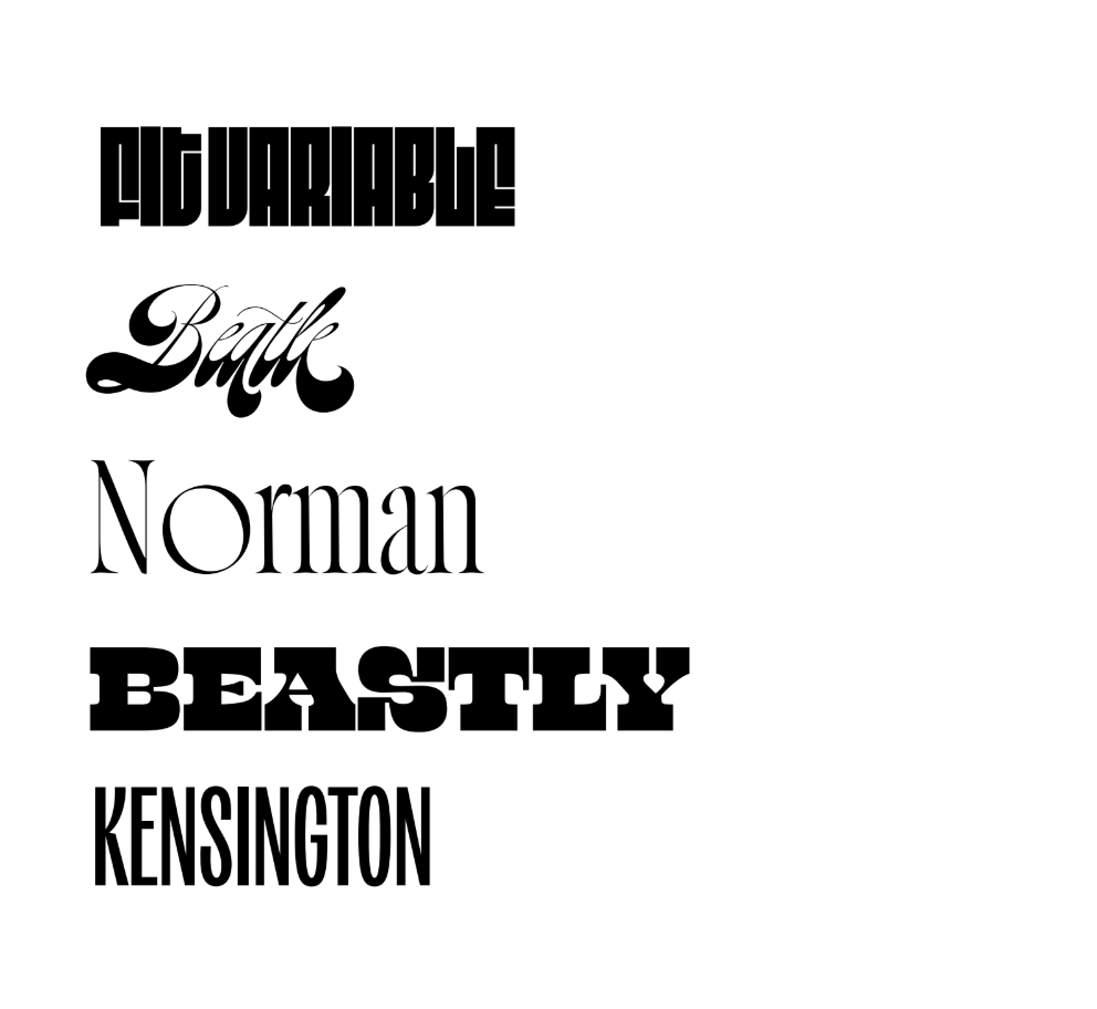
For typography, I focused on balancing readability and impact. Bold fonts for main headings make key content stand out, sleek italics for subheadings add flair while staying clean, and a versatile sans serif for body text ensures a smooth reading experience.
Editorial Colors & Typography
Each edition features its own color palette, refined between issues based on feedback about readability and visual impact. Body text remains consistent across editions for readability, while bold editorial fonts change to reflect each season's mood and theme.
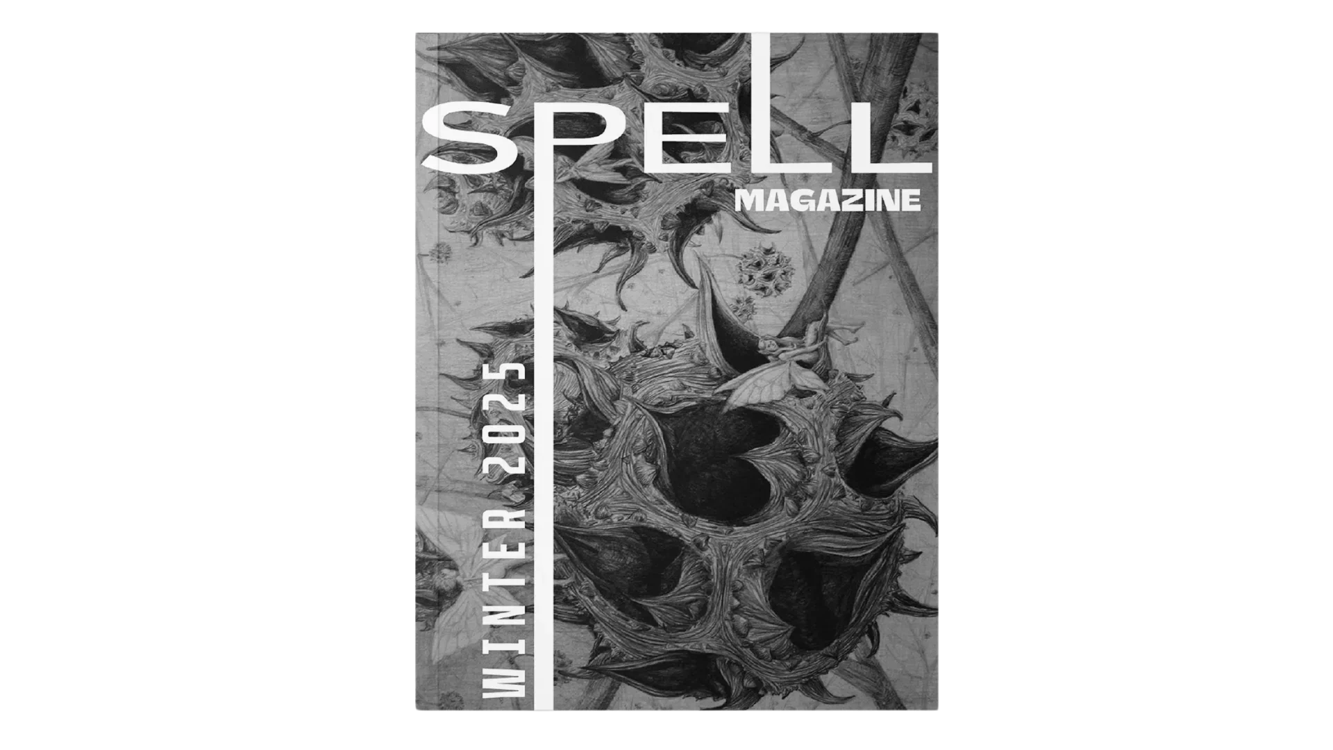
First Edition Colors & Typography

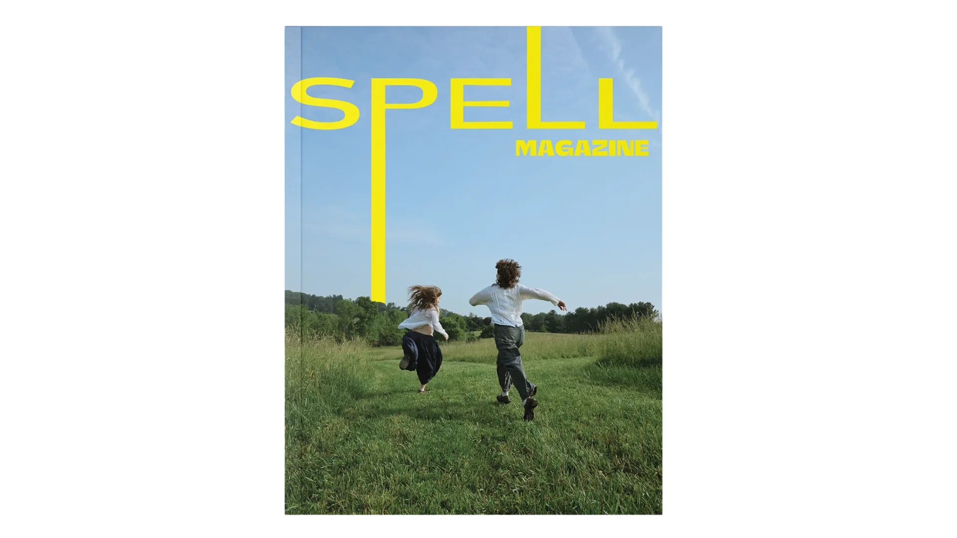
Second Edition Colors & Typography
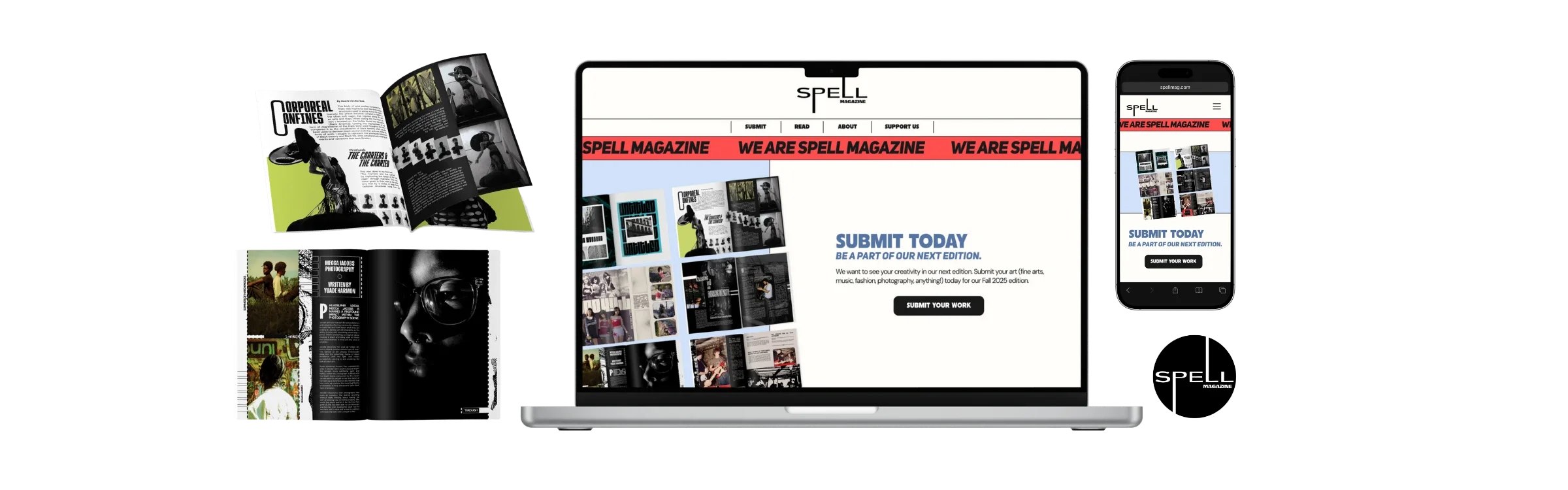
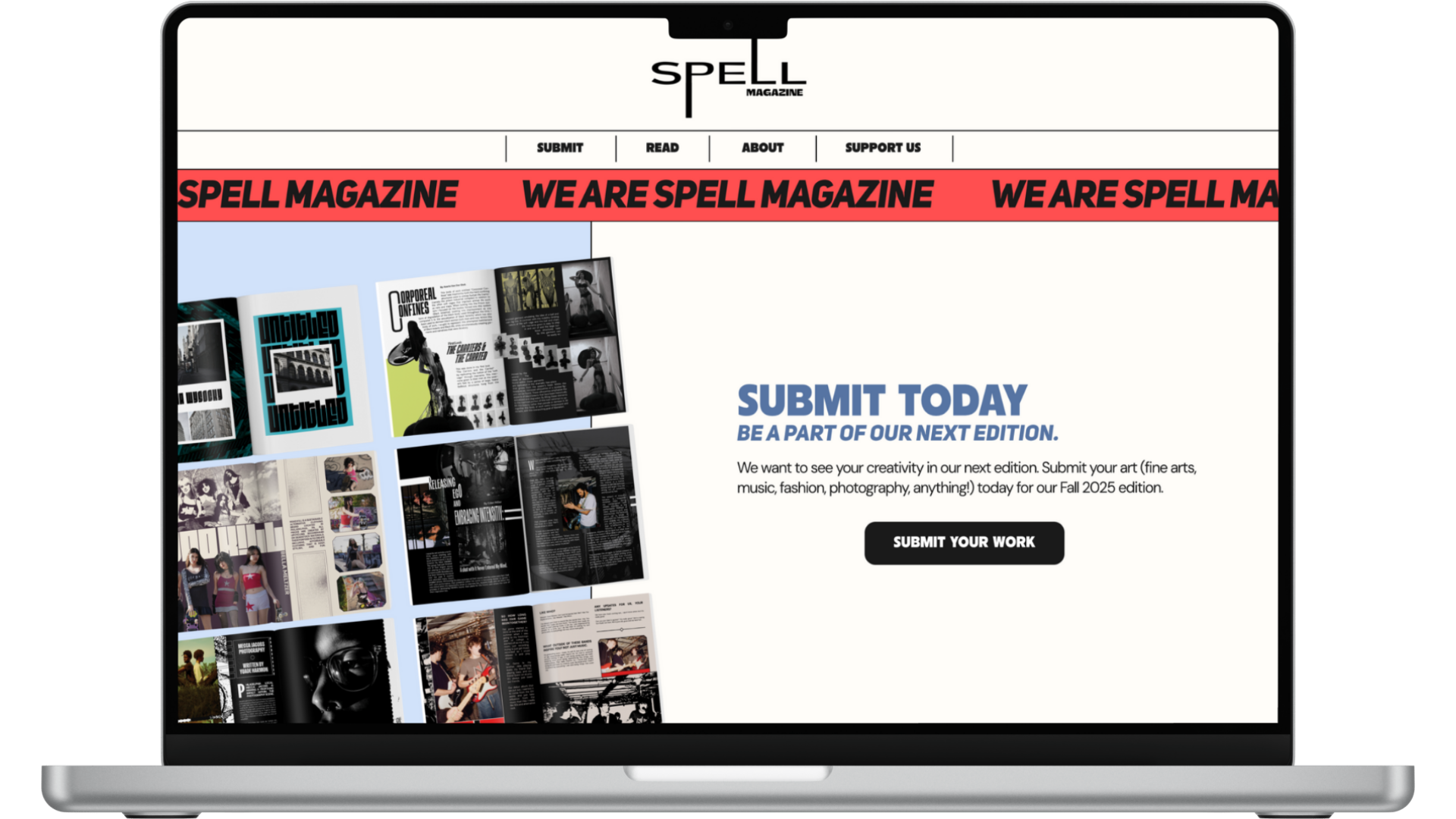
DesignWebsite Design
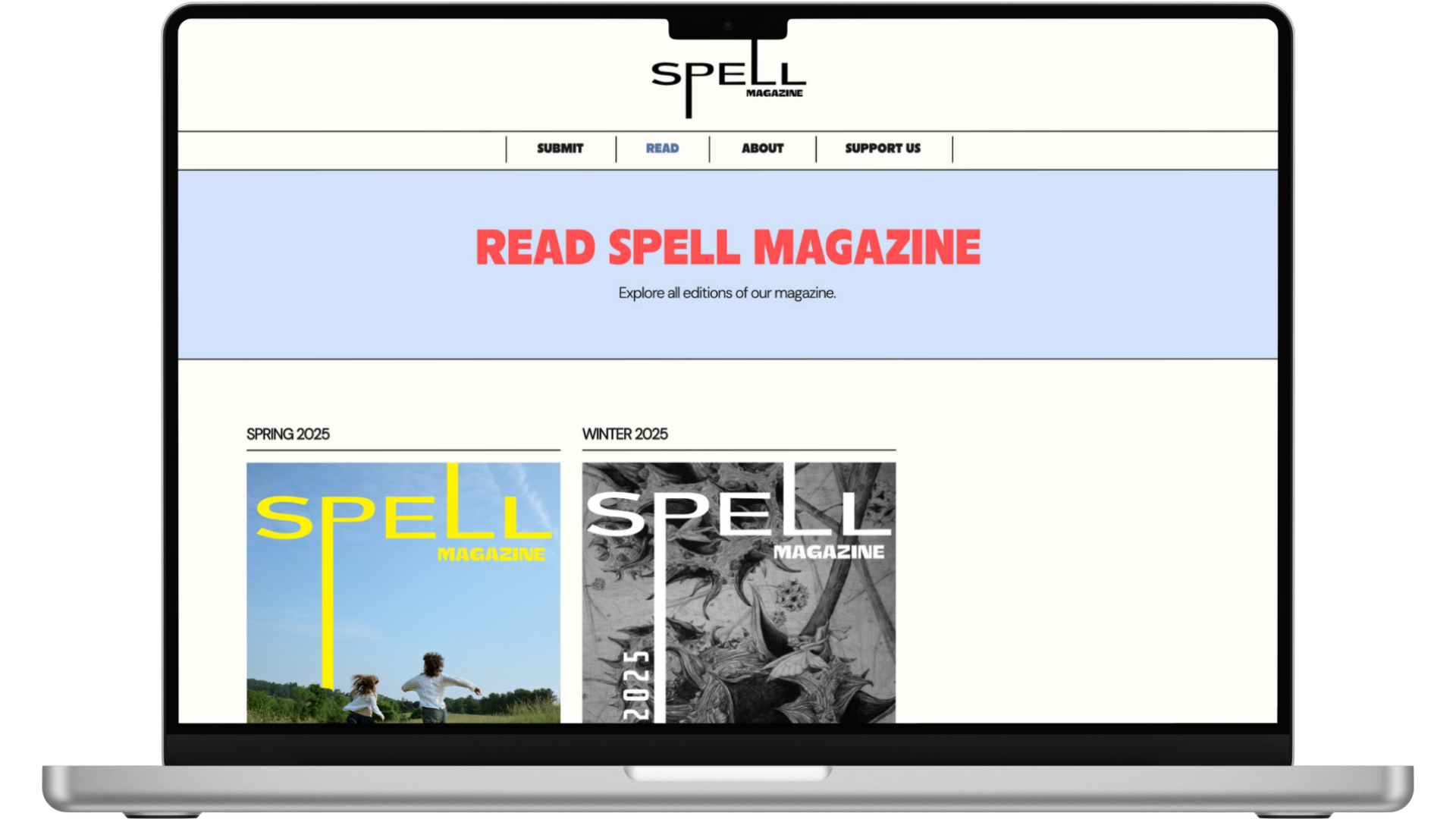
The SPELL website serves as the central hub for the magazine. The site features:
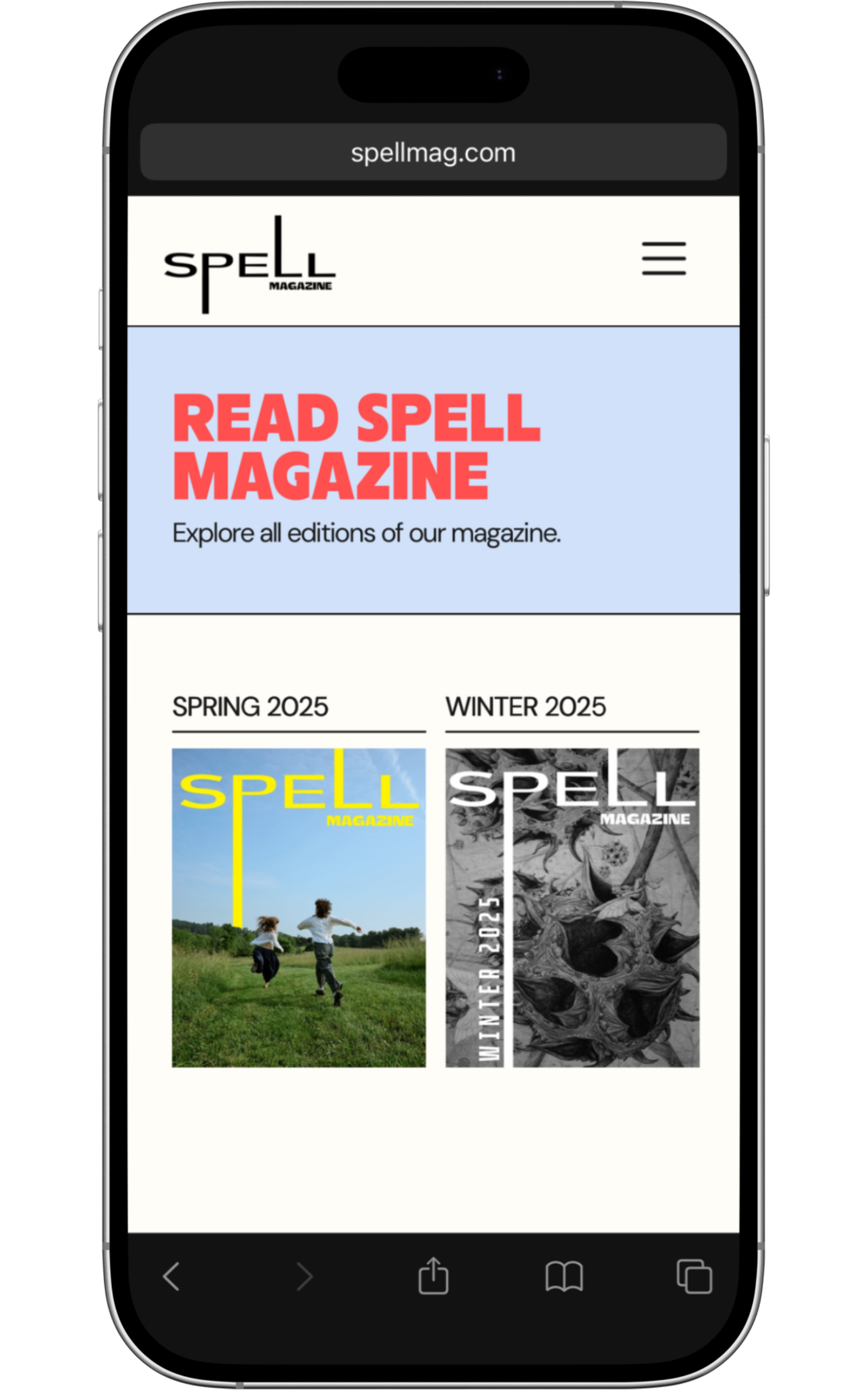
Homepage: Highlights the latest edition and featured artists
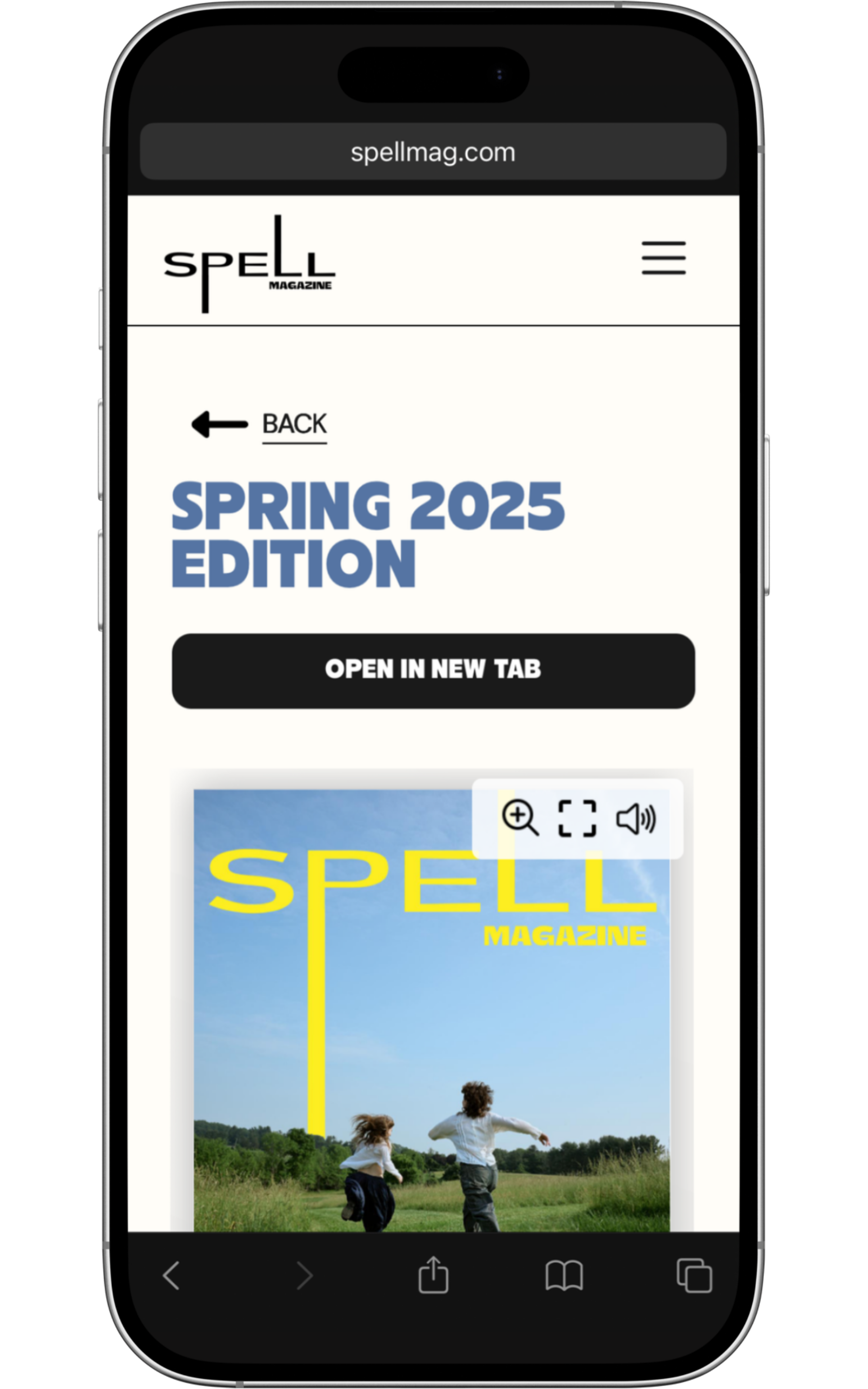
Read: Browse all past editions
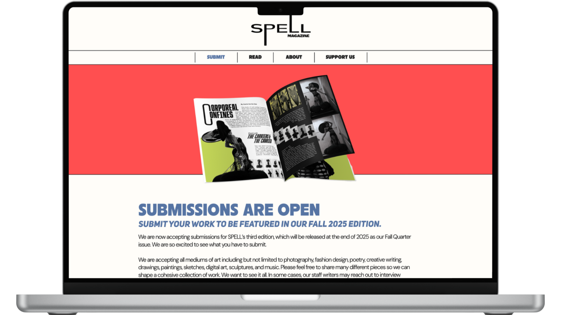
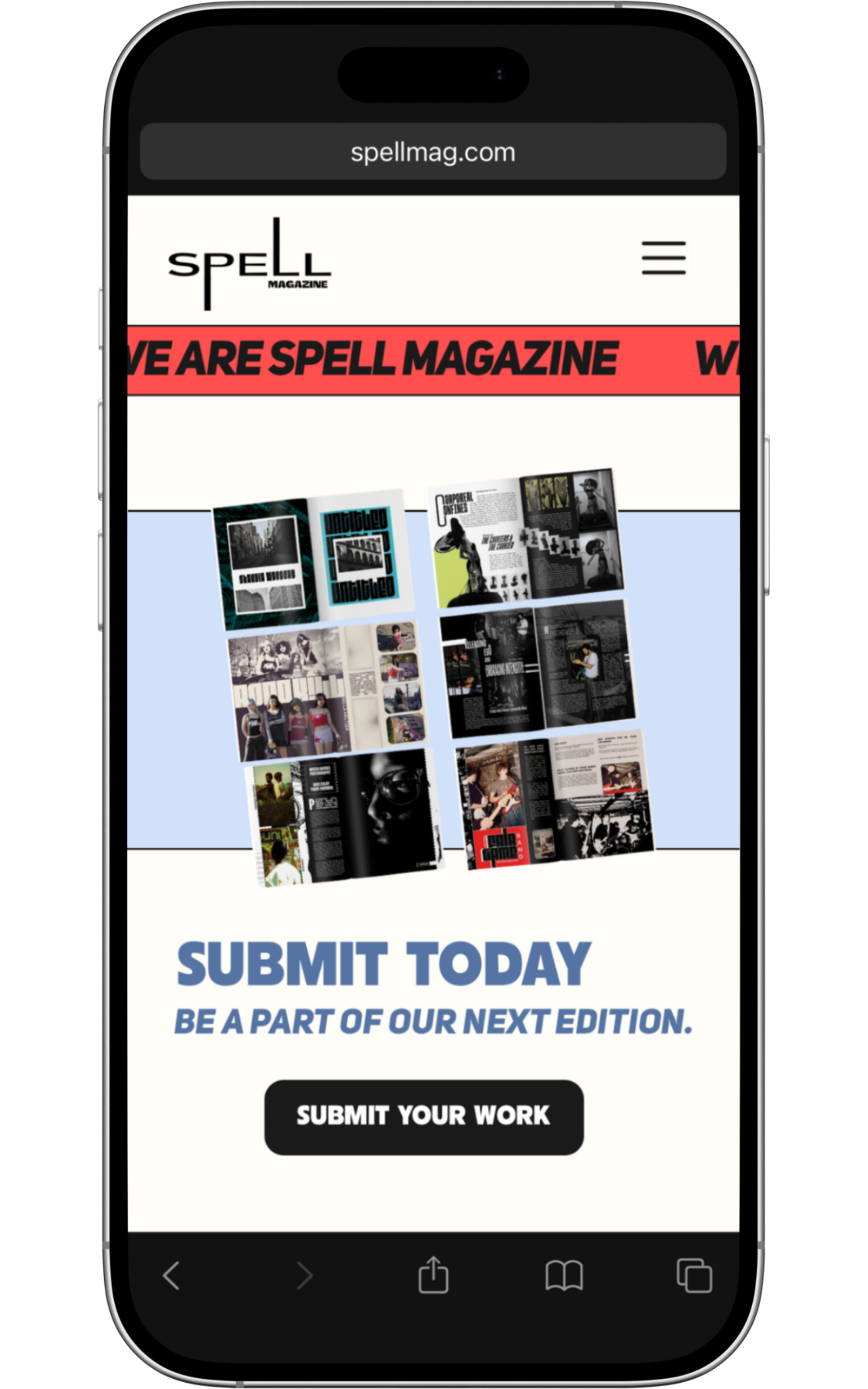
Submit: Clear submission guidelines with streamlined form
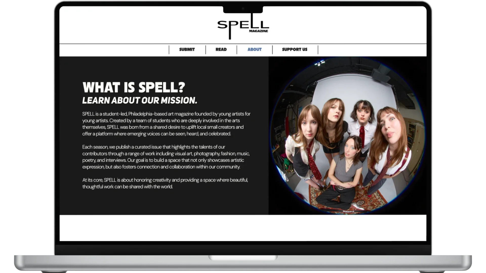
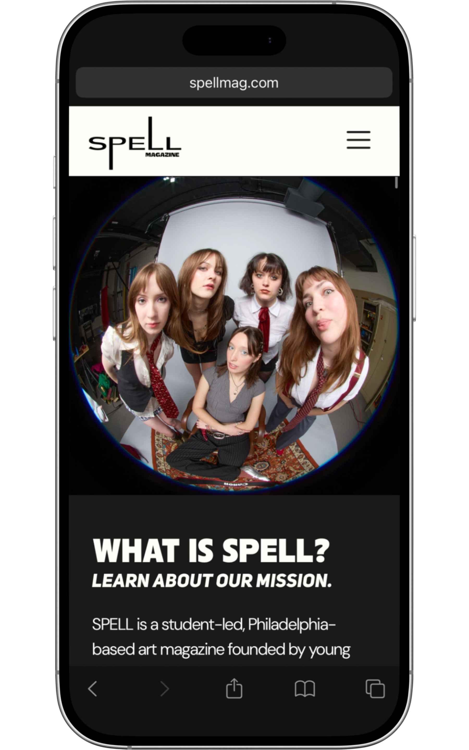
About: Team bios, mission statement, and contact information
Support Us: Donation link to help bring our pages to print and our email list
The design is mobile-responsive and optimized for discovering content across devices.
Take a look below to see mock-ups of the desktop and mobile versions of the website or take a look through SPELL Mag’s website.
Desktop
Mobile

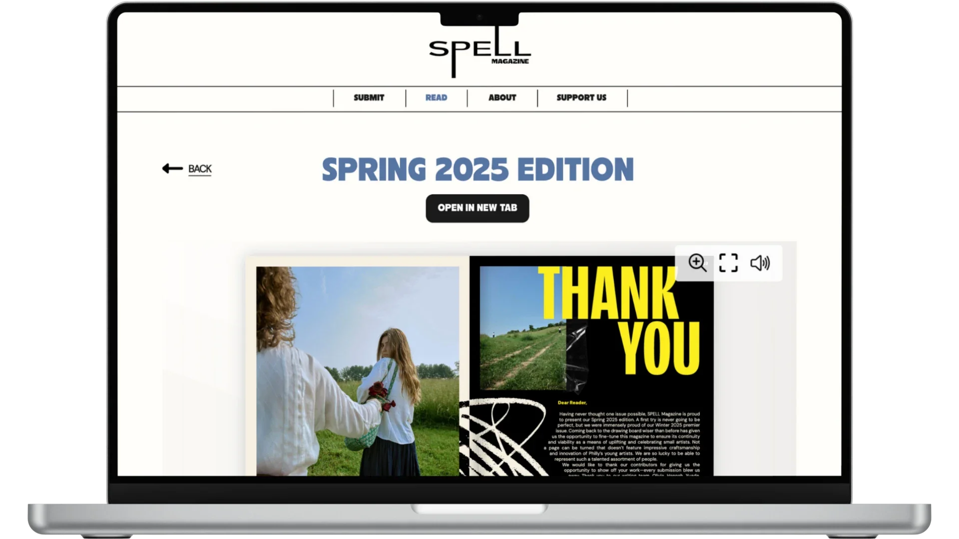
Editorial Design
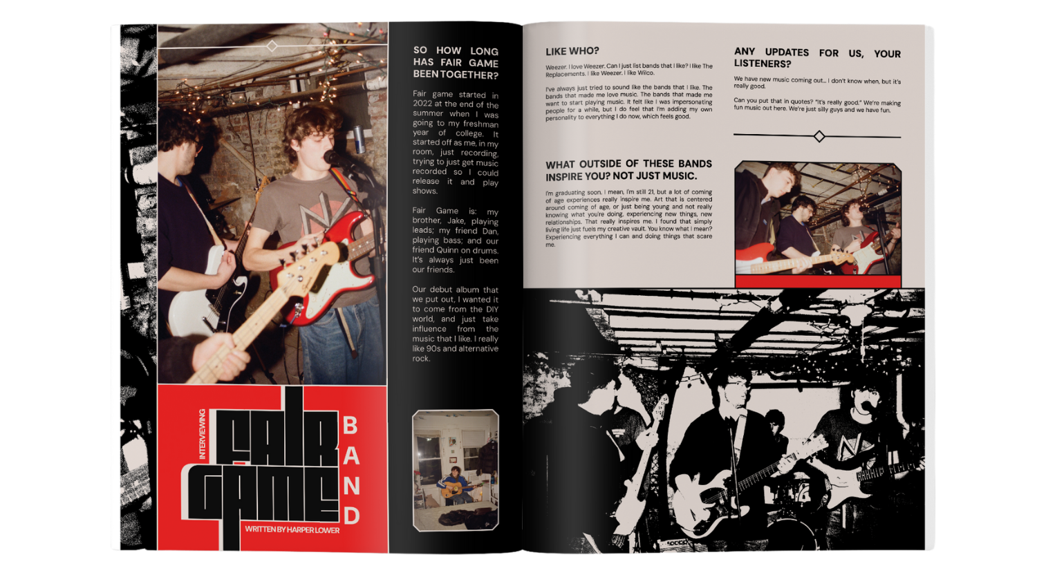
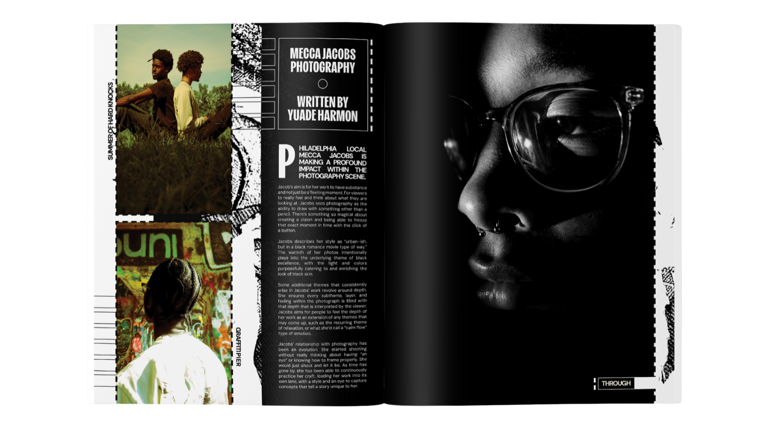
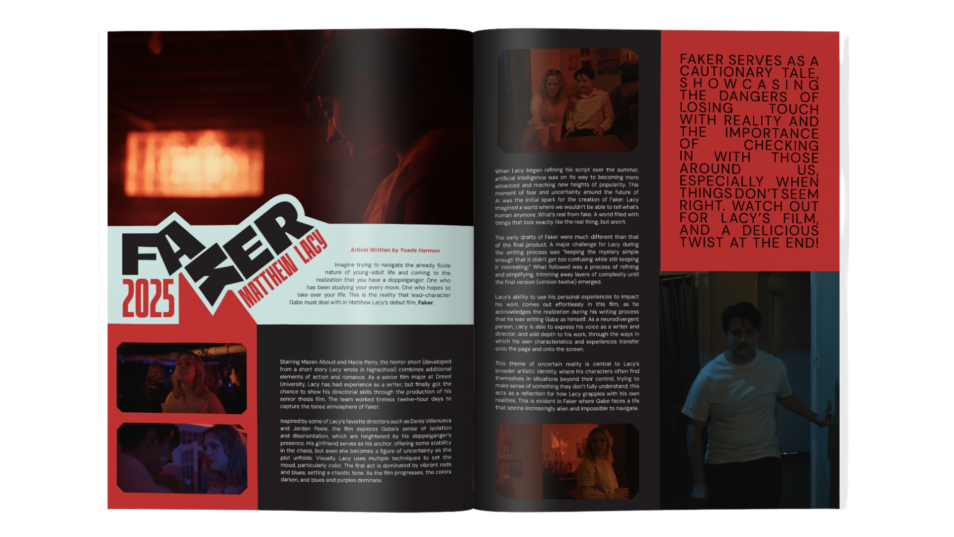
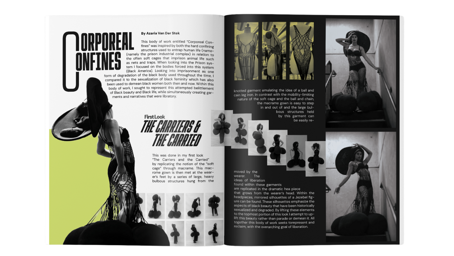
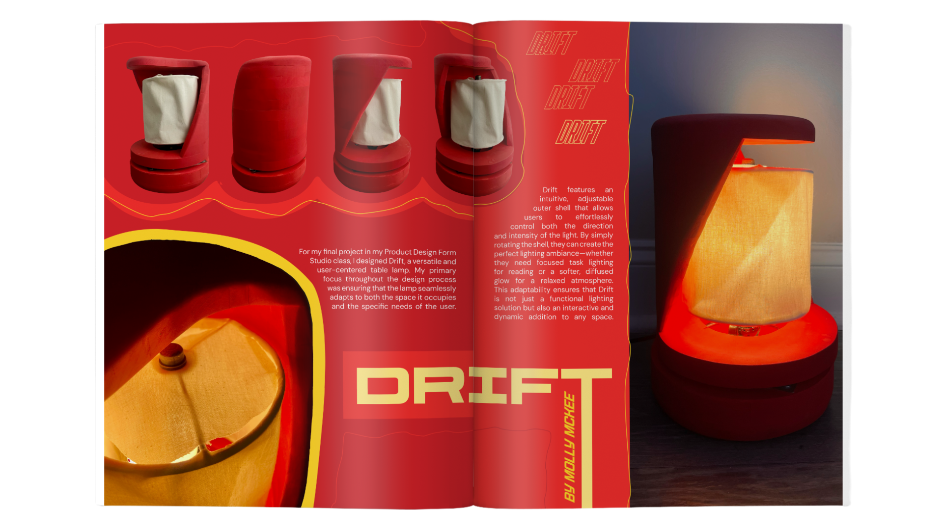
For each spread, I balance typography, layout, and imagery to showcase artwork while maintaining visual cohesion throughout the edition. Working alongside co-creative director Drew, we design spreads both independently and collaboratively. The design process involves planning layouts that accommodate various art forms (photography, illustration, poetry, mixed media), collaborating with artists to understand their vision and intent, and iterating based on how pieces work together in sequence.
Each edition features submissions from Philadelphia student artists across all disciplines. We welcome all forms of creative work without thematic restrictions, allowing contributors to share what matters most to them. Our team of interviewers gathers stories from featured artists, adding depth and context to the visual work. Between editions, we've refined spread layouts to improve pacing, balance text and imagery, and enhance overall readability.
Featured below are spreads I have designed for SPELL Magazine. To view the full editions, explore the Winter 2025 Edition or Spring 2025 Edition.
Winter 2025
Spring 2025