BRand & Visual Identity Update
Weckerly’s existing brand identity no longer reflected the company’s aesthetic or physical presence. An inconsistent color palette caused visual disconnects across digital and in-store touchpoints, especially where blue tones clashed with the pink-based Rittenhouse shop. A refreshed visual identity was needed to unify the brand and align with the owner’s creative vision.
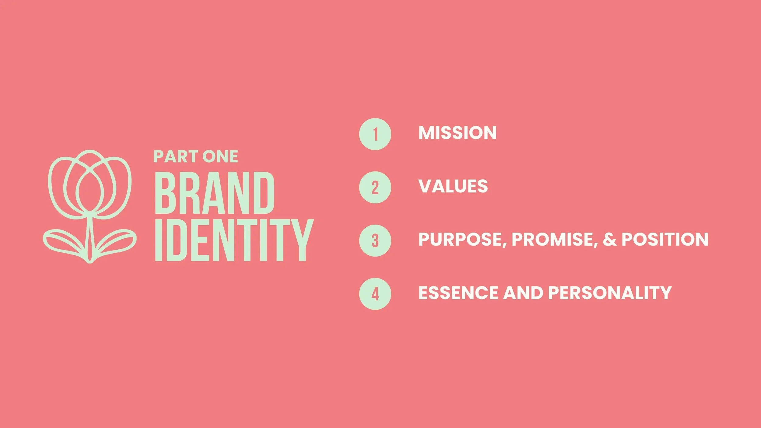
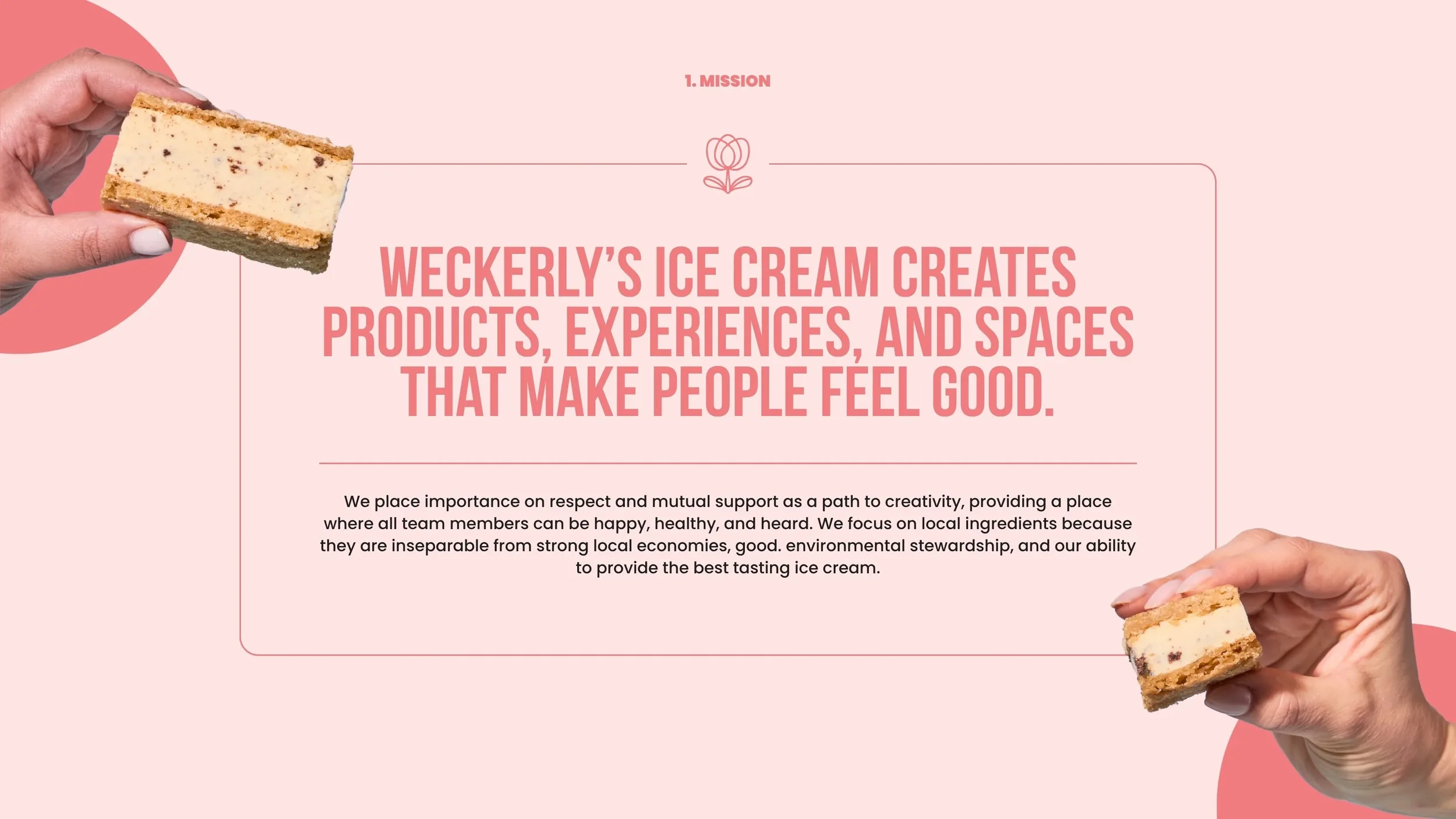
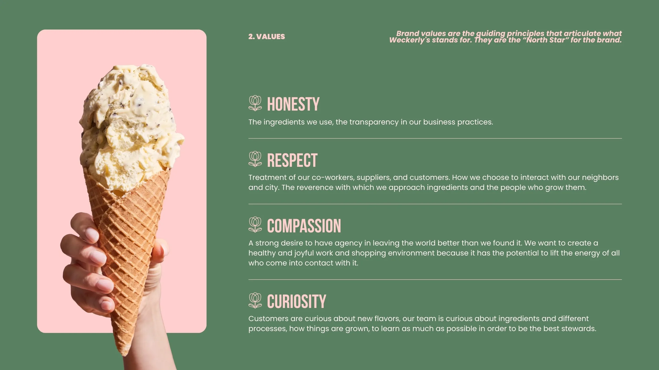
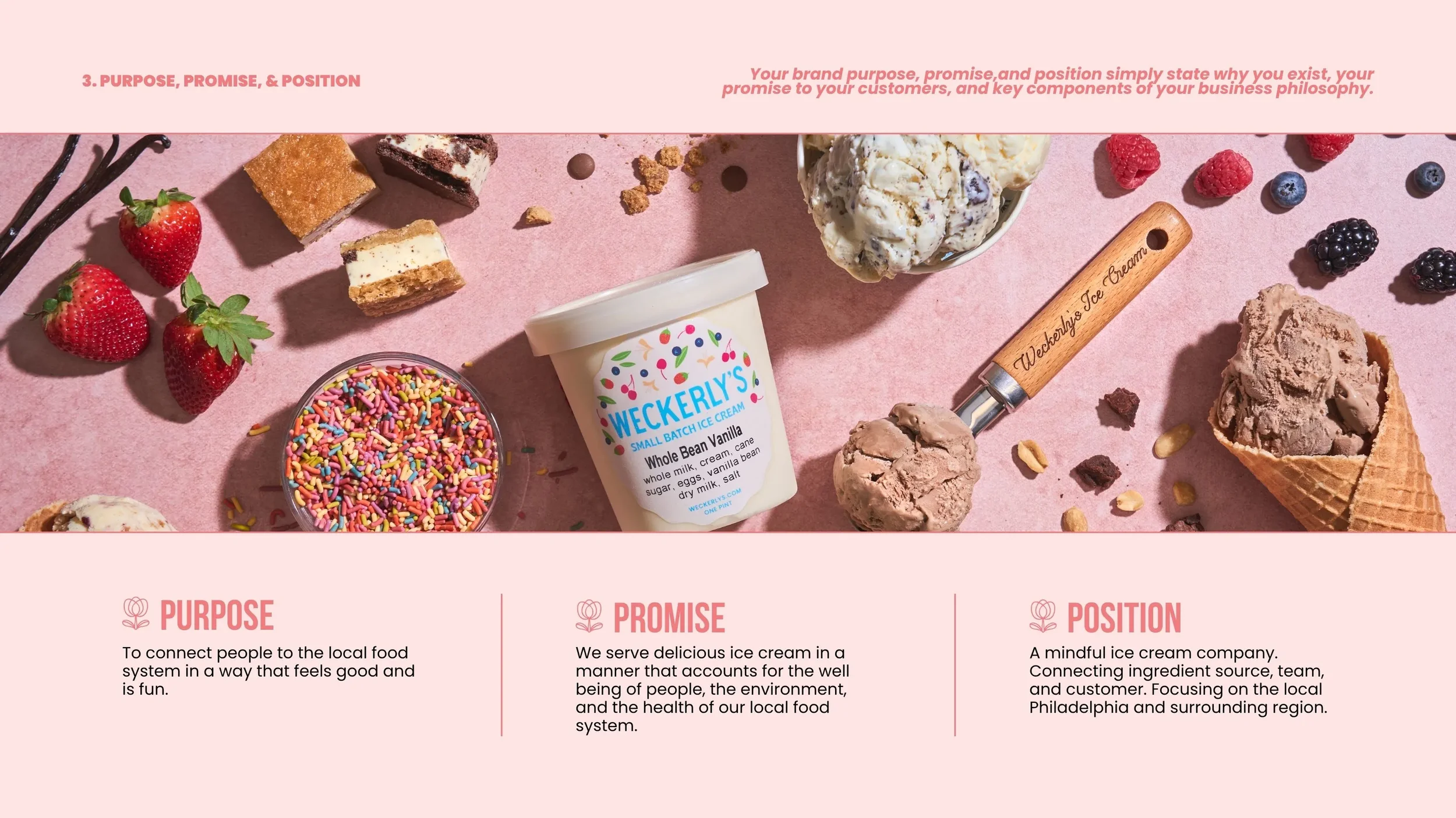
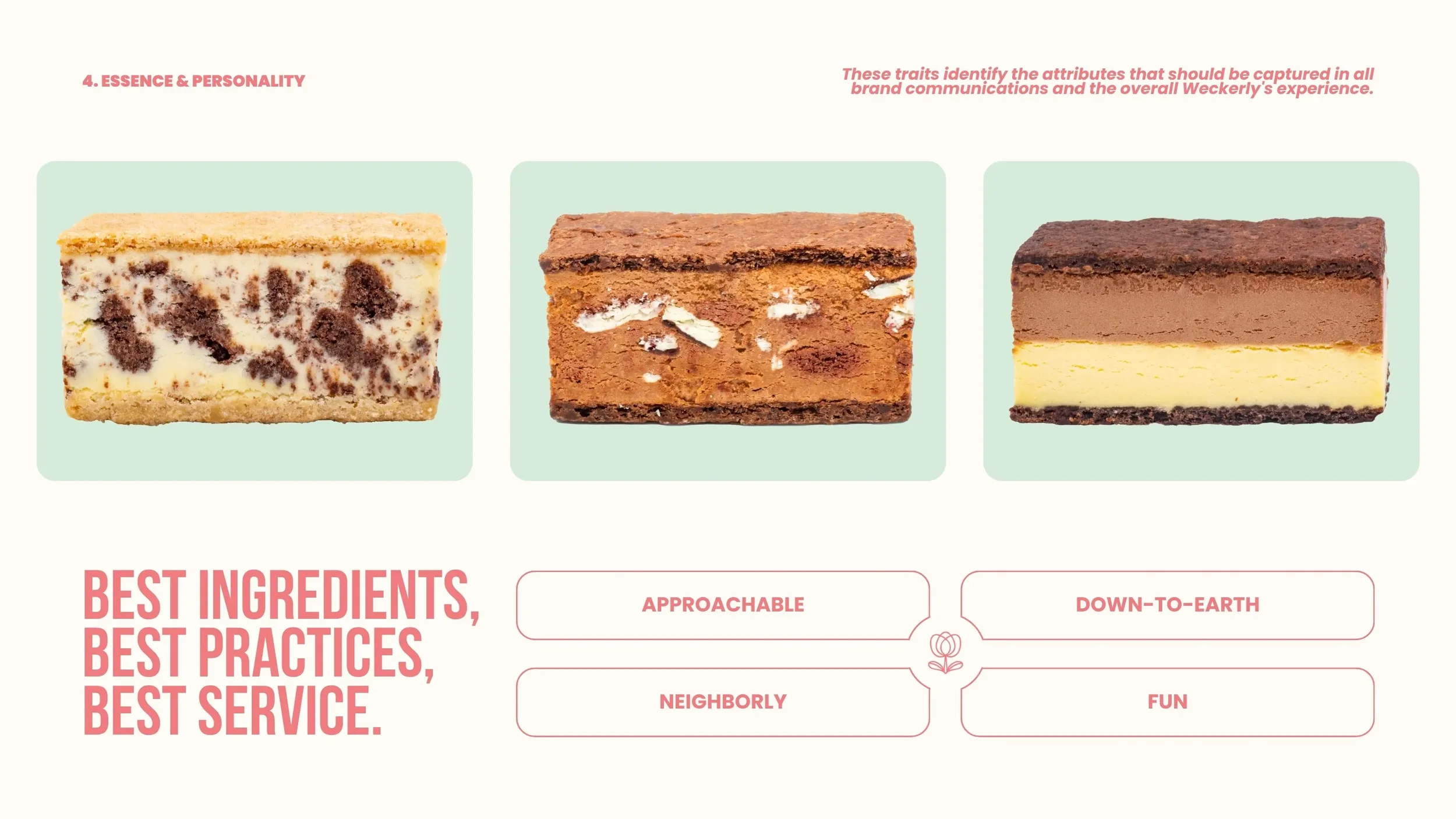
BRAND IdentityI began the rebrand by updating Weckerly’s brand guidelines, starting with the foundational elements that define the brand’s voice and purpose. These include the mission, values, promise, purpose and position, and essence and personality. Each was reviewed and refined to ensure it aligned with where the company is today and where it is heading. The document was designed and formatted to visually represent the brand’s personality through color use, layout, and tone.
Visual IdentityThe next phase focused on creating a cohesive and flexible visual system that could extend across all brand touchpoints, both digital and physical.
Color Palette
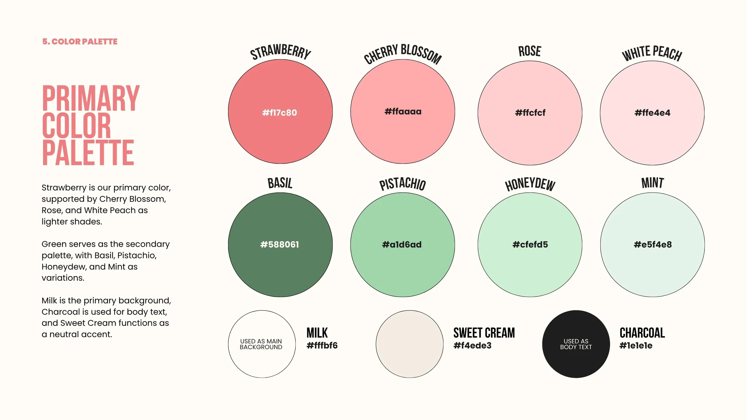
The new palette centers on two main color families: pinks and greens, paired with warm neutrals for balance.
Pinks: Strawberry (#F17C80), Cherry Blossom (#FFAAAA), Rose (#FFCFCF), White Peach (#FFE4E4)
Greens: Basil (#588061), Pistachio (#A1D6AD), Honeydew (#CFEFD5), Mint (#E5F4E8)
Neutrals: Milk (#FFFBF6), Sweet Cream (#F4EDE3), Charcoal (#1E1E1E)
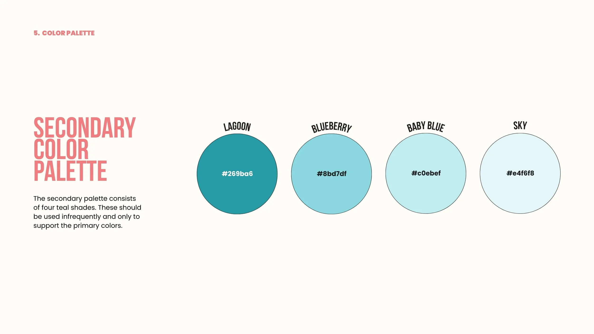
Accents (used sparingly): Sea Glass (#269BA6), Coastal Blue (#8BD7DF), Mist (#C0EBEF), Sky Tint (#E4F6F8)
Pink was retained from the previous palette to maintain brand recognition and warmth. Green was introduced to balance the palette with natural tones that reflect Weckerly’s handmade and ingredient-driven character. The blue tones were softened and reduced to create harmony with the Rittenhouse shop’s pink interiors and overall aesthetic.
Logo and Marks
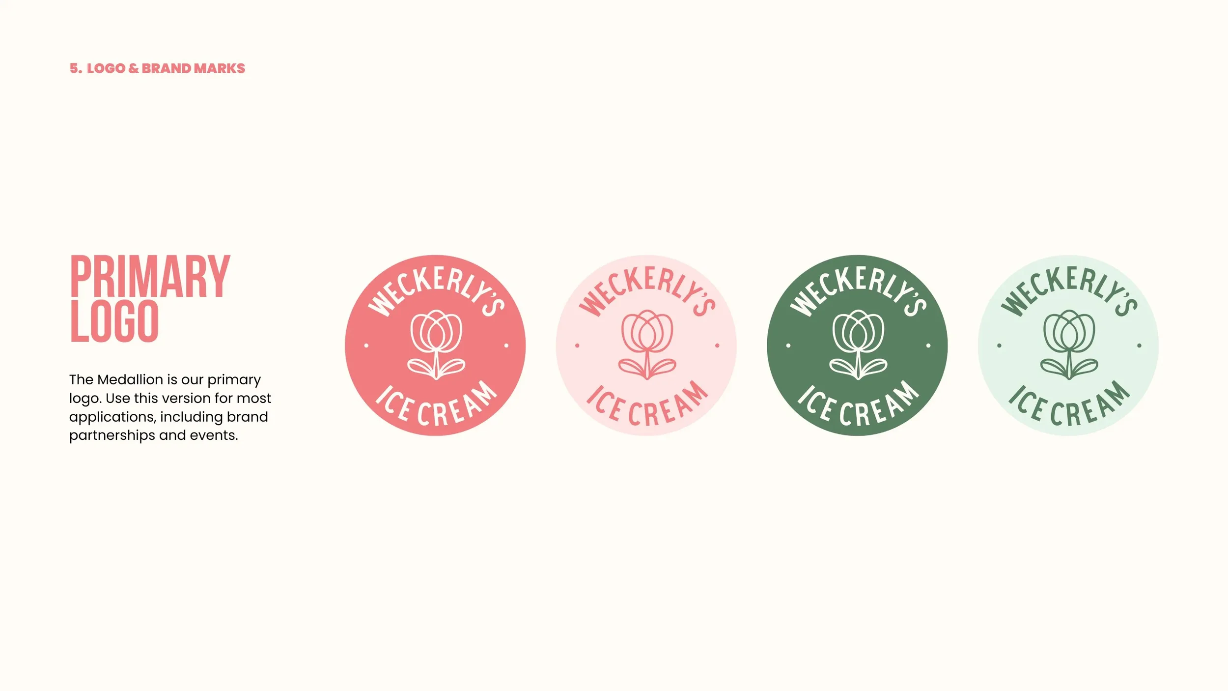
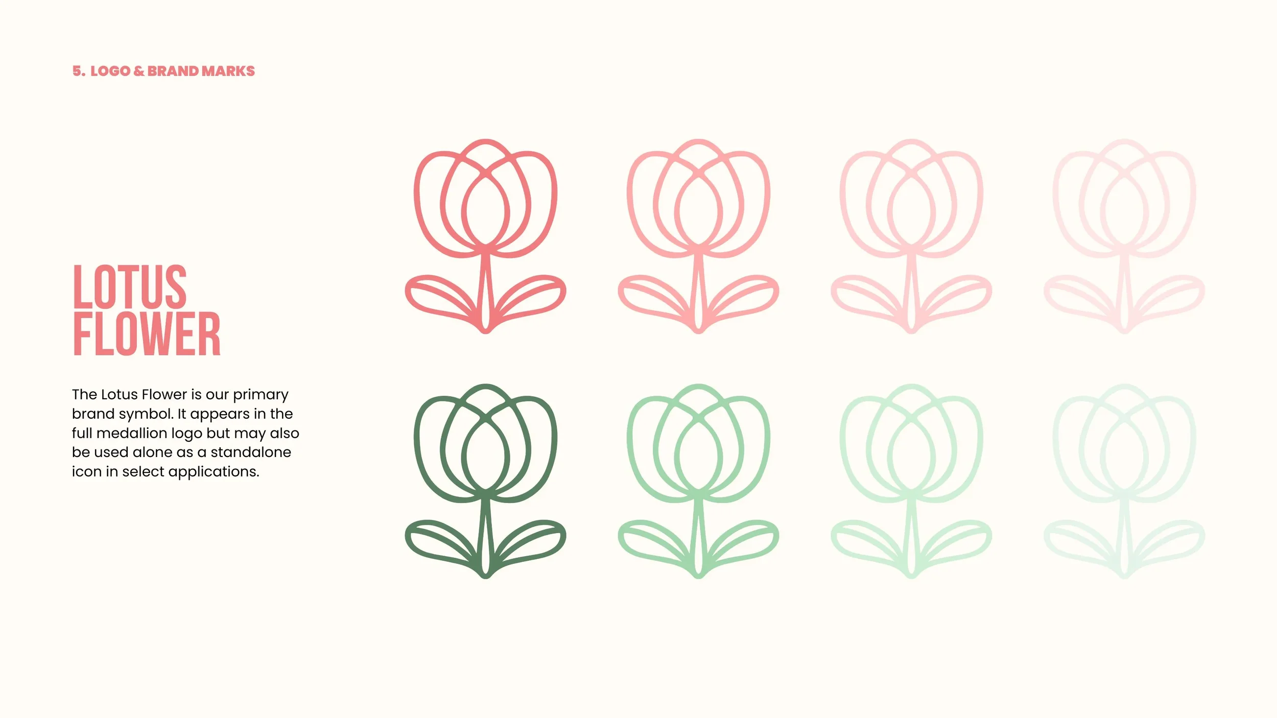
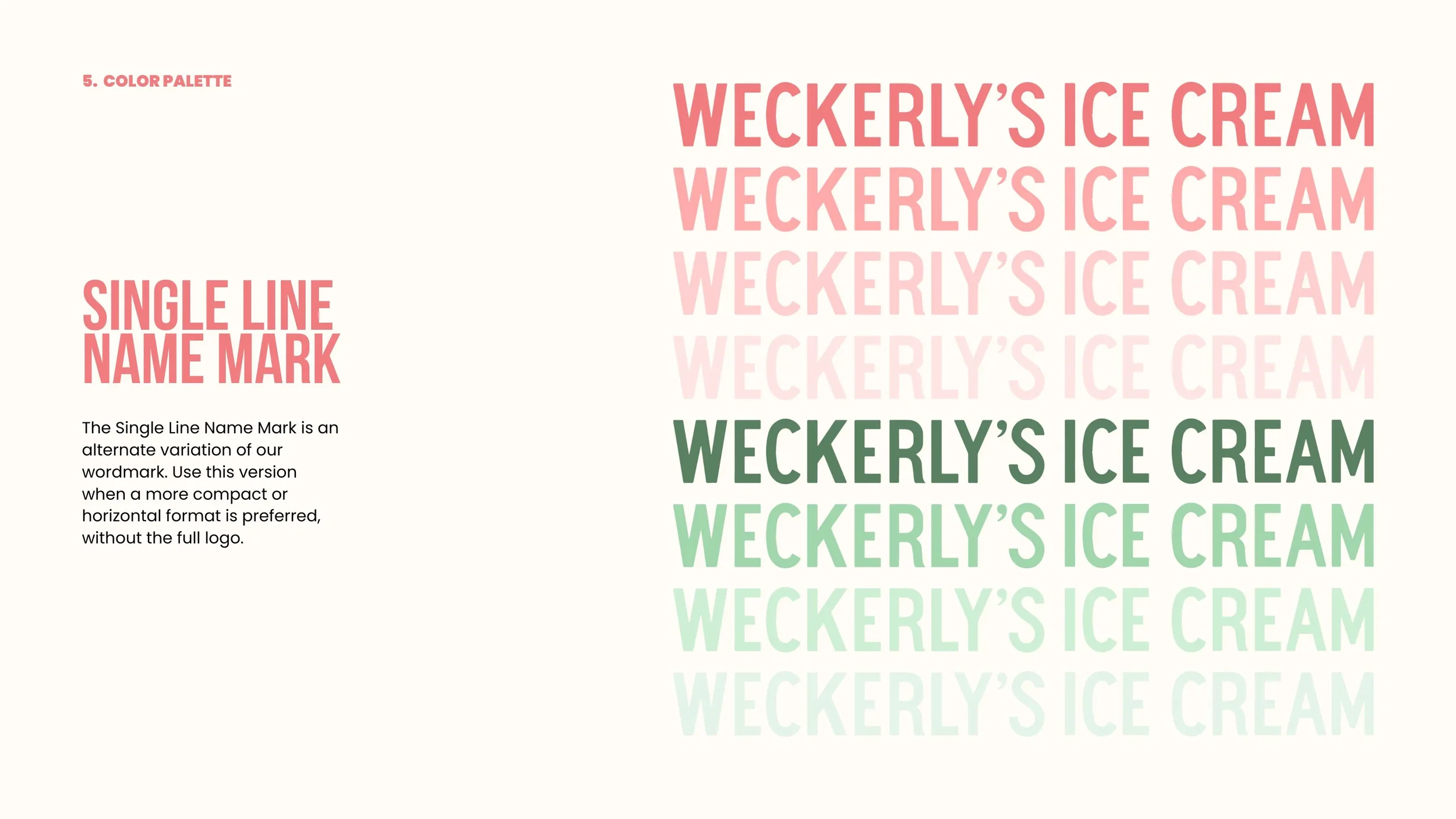
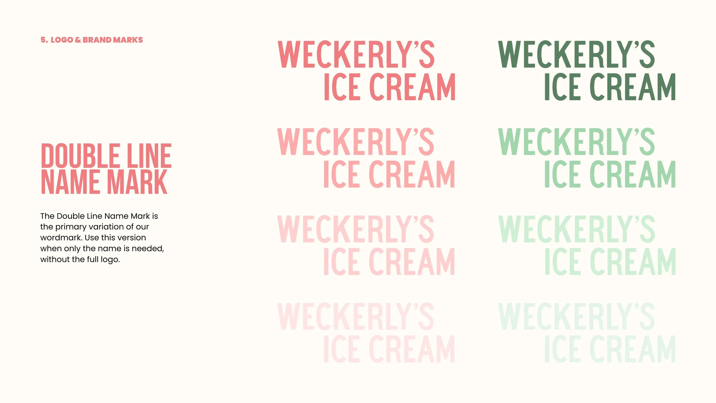
A new medallion logo was created by merging elements from past and present branding, symbolizing the evolution of Weckerly’s identity. The lotus flower and wordmark were refined for versatility and clarity across applications, each with guidelines for placement and usage.
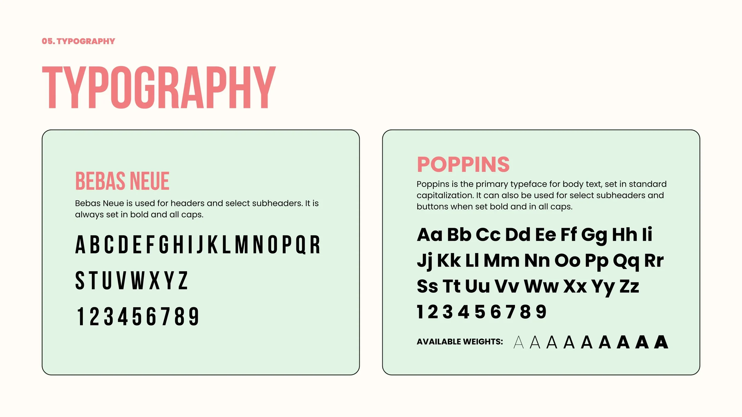
Typography
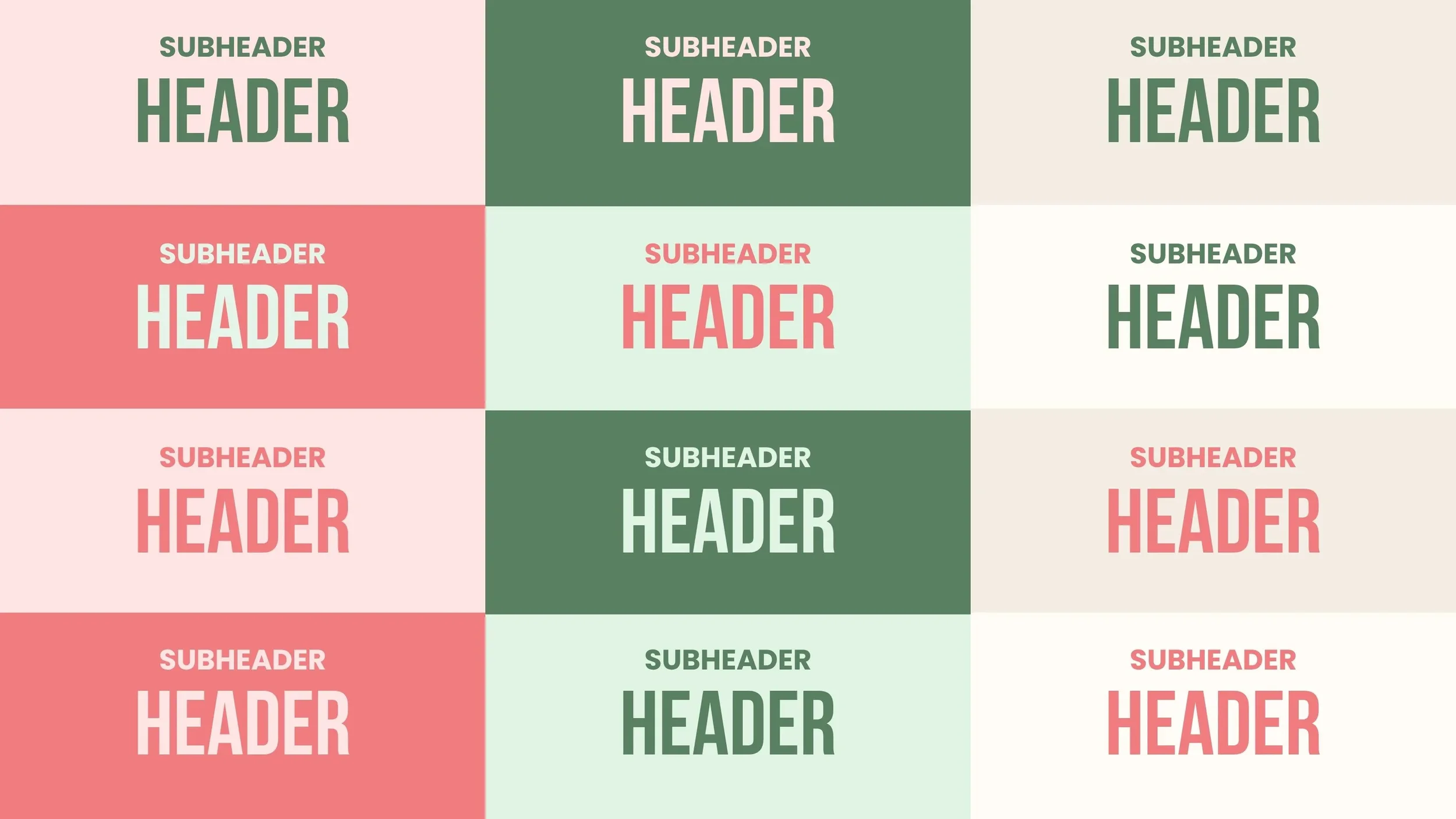
This combination provides a clear hierarchy while maintaining a friendly and confident tone that reflects Weckerly’s approachable but polished identity.
Bebas Neue: For headers and select subheaders, always bold and all caps.
Poppins: For body text and small accents, used in standard capitalization or bold all caps for buttons and subheaders.
Implementation
The new brand identity has been applied across a wide range of promotional materials, social media templates, and digital touchpoints to ensure a consistent and recognizable look. The updated colors, typography, and logo system appear throughout online platforms and marketing campaigns, strengthening Weckerly’s visual presence.
In store, the rebrand aligns naturally with the Rittenhouse shop’s existing pink and green interior. Pink has been extended across coffee and ice cream cup stickers, in store signage, and display materials to maintain cohesion between physical and digital environments.
Since the rebrand began rolling out in September, many key elements have already been implemented, with remaining touchpoints such as pint packaging and select legacy materials currently in progress. The goal is a complete and unified rebrand across all customer facing and operational assets.

